The first mockups of theme that will be used as default in Firefox 2 have been released.
Three vendors (Meta, Radiant Core, and Raiz Labs were asked to submit proposals for a new theme. They were given the criteria that the new theme had to
- respect OS native look and feel
- appear modern and contemporary with current web and client apps
- appear consistent across platforms
- have minimum to zero code impact requirements (ie: all CSS and icon work)
The returned proposals led the team to focus in on four specific areas of priority for Firefox 2:
1. Search Bar: new icon required for the "search" action, design required to visually associate an "action button" with a textbox, design for showing search suggestions, design for making it clear that user can select the search engine.
2. Icon Polish: use shapes and metaphors from the existing *Stripe themes, but unify (and soften?) the colour palette and update the edges, detail, styling and gloss to match better on Vista, with modern XP apps, and OS X.
3. Tab Strip: improve distinction of selected tabs, differentiate appearance of background tabs from tab strip, optimize close tab button for use on all tabs.
4. Buttons in Textboxes: make buttons that appear in textboxes distinctive and provide affordances to indicate that they are "clickable" elements.
Of the vendors, the team selected Radiant Core to continue working towards an implementation of the new theme.
So here it is, the mockup of the theme:
- icons have been sharpened and made to look a little glossier, and colours have been / will continue to be adjusted to match OS palette
- standard treatment for "end cap" buttons on a textbox like "Go" and "Search"
- new light treatment for drop-down buttons until the user hovers in that textbox at which point the buttons will fill in
- gradients on tabs and the tabstrip to make it easier to see the selected and background tab
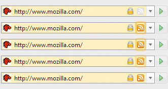
The tabs have been changed quite considerably and in my opinion look much better than before:

- first tab shows selected state with hover on close button
- second tab shows background state when mouse is hovering over it
- last tab shows deselected state
The buttons in textboxes have been given a rounded look and glow when you hover over them:
- buttons in textboxes, dropdown buttons and endcaps will have desaturated borders and backgrounds, but when user hovers in that textbox, they will indicate that they are 'active' and can be clicked
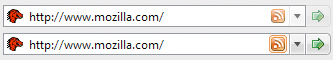
The search box has been updated considerably as well:
- box to the left is used to change the search engine
- it will glow when a new search engine is available
- endcap button on the right is used to perform a search
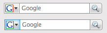
The RSS icon will make big changes to the address bar - where as, the whole bar (and the icon) will glow when there's an RSS feed on the page:
- the RSS indicator will always be present in the location bar
- when a feed is found, it will light up to draw attention to itself
- this design has since been modified to bring the glow closer to the RSS icon itself
Overall, I'm much looking forward to the new design - so I hope they'll hurry up and get the browser released.


-1 Comments - Add comment