Microsoft has gone through more than its fair share of names for its design language - from Metro to Modern to 'Microsoft design' - but as Google continues to evolve its cross-platform products into a more mature and connected suite, it's keen to ensure that everyone understands exactly what its identity system is called.
Today, as part of its I/O event, Google released a video giving a flavour of its unified design language, which it calls "Material Design".
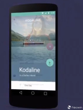
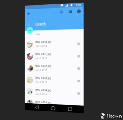
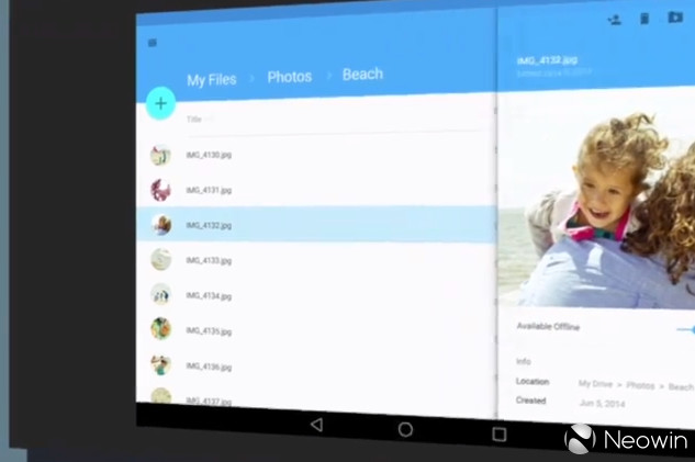
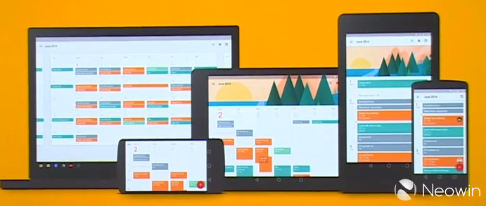
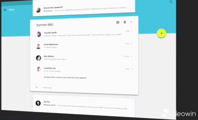
The video shows it in action in glimpses of Calendar, Gmail, Maps, and a range of apps on devices and online. As is the current trend in digital design, it embraces flatter user interfaces, large blocks of colour and a greater focus on typography.
Google's Matias Duarte said: "Material Design is beautiful and bold, because clean typographic layouts are simple and easy to understand. Your content is the focus." The company has updated its 'Roboto' system font, "so that designers and developers can use one typeface, designed and optimised for every screen, from your watch to your laptop to your television."
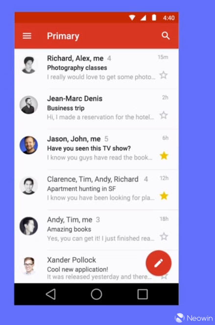
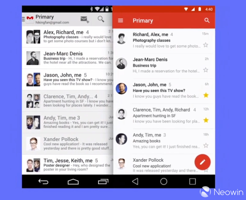
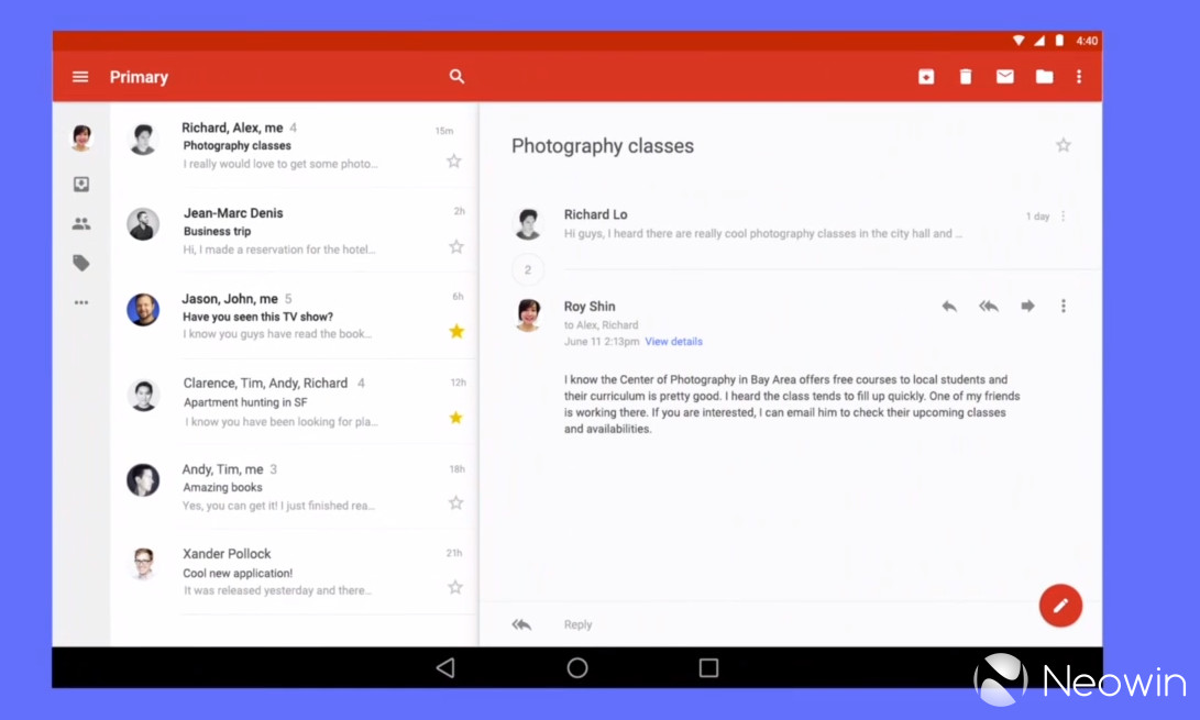
The effect of the new design language can be seen in the image below, which shows how the Gmail interface has been dramatically improved to make content more clear. The new look Android universal navigation buttons - back, home and the task switcher - are also visible on the new screenshot.

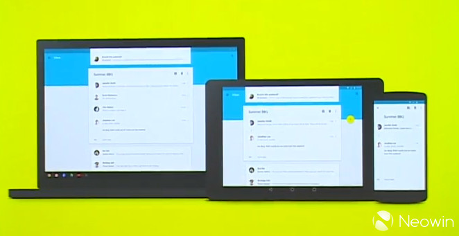
It's not just Android that will be affected by the new design standards. Google is introducing Material Design across all of its products, including Chrome OS and Search on the web.
The company has also completely overhauled system animations, promising a dramatically enhanced user experience, starting with the Android L release. In addition to a new 'Material theme' for Android, the flatter user interface elements will be combined with 3D views including real-time shadows, and new transitions between on-screen activities. UI elements respond with a 'material touch effect' as the user interacts with them, while a 'nested scrolling' effect contracts and expands other elements as users scroll up and down the screen.
Google says that it is "a visual language for our users that synthesizes the classic principles of good design with the innovation and possibility of technology and science." It adds: "A material metaphor is the unifying theory of a rationalized space and a system of motion. Our material is grounded in tactile reality, inspired by our study of paper and ink, yet open to imagination and magic. This is material design."
It says a lot that Google opened its keynote by leading with its new focus on design, and on establishing a more stylish and consistent experience for its users across all devices and products.

A Google Design site now features resources, guidelines and other information to help developers and designers to embrace Material Design to create better experiences for their users.
Gallery: Google New Design


111 Comments - Add comment