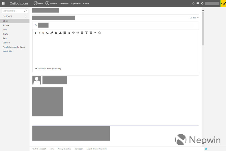
Microsoft's free email service, Outlook.com, appears to be testing a new email creation template. If you take a look at the image above, you can see the updated interface that offers a cleaner and more modularized layout when compared to what is currently used by the email service.
The large gray boxes are blocking sensitive information (just to clear up any confusion) but do give you a good sense of what the new layout will look like if it gets pushed to all users. Posted below is the current layout so that you can see a comparison between the two designs.

We don't know if Microsoft will push this layout to all users as they typically test many different styles and formats before updating all accounts.
The layout follows the traditional vertical arrangement for the email fields and content that many are accustomed to using, but keeps the navigation items in the left column viewable at all times. This is different from the current design that hides the navigation items and instead replaces it with a 'To' field in that area of the page.
Let us know if you see this layout in your inbox and of course, if you see something different, make sure to send us a tip.
Thanks for the tip crgmartindale!


15 Comments - Add comment