.jpg)
YouTube has announced the rollout of its redesigned website with a cleaner look, aimed at easier discovery and management of playlists.
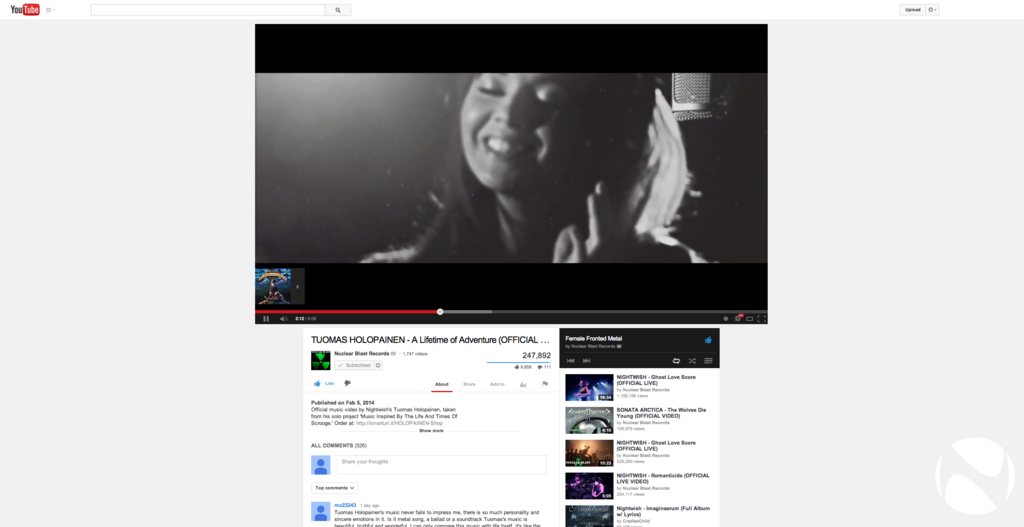
The new YouTube makes use of Google’s card-based design language seen on Google search, Google+ and the various mobile apps such as Google Now. The content is now presented in a center-aligned manner, additionally, the sidebar is hidden by default in order to get a cleaner interface while watching videos.
According to the YouTube blog, the website redesign aims at making it easier to view and manage content from playlists across the site. The guide now has all of the user's personal playlists in addition to the ones from other subscribed channels. Editing playlists is also said to be easier through a page created for the user.
.jpg)
Although YouTube developer, Yining Zhao, has mentioned that the new design of the website fits "neatly on any screen size,” it has been observed (see gallery images) on monitors with large resolutions, that the video view looks rather unappealing as there is a lot of white space around the player. Of course, this is still somewhat better compared to the previous version where all the white space was pushed to one side of the screen. Users with monitors using resolutions less than 1920x1080 may not notice much of a difference.
The redesigned website has already been rolled out worldwide and users can check it out for themselves.
Gallery: YouTube on Retina
.png)
.png)


33 Comments - Add comment