About two years ago, images from a presentation held by Valve leaked, revealing that a UI refresh for the Library portion of the Steam client was in the works. This was at long last confirmed in January of this year, after which the company showed off the UI during GDC, and proceeded to pin down a beta release date of September 17.
Before focusing on the update that's just arrived, there are several other improvements worth noting, which were previously made available.There's the enhanced "Upcoming" tab for releases, the Twitch-like broadcasting ability, publisher and developer homepages and curator-like DLC pages, better wishlists, a Steam Labs program for experimental features, and of course, the overhauled chat which made its way to folks on the desktop via the main client, as well as in the form of a separate app for iOS and Android. And now, let's take a closer look at the new UI.
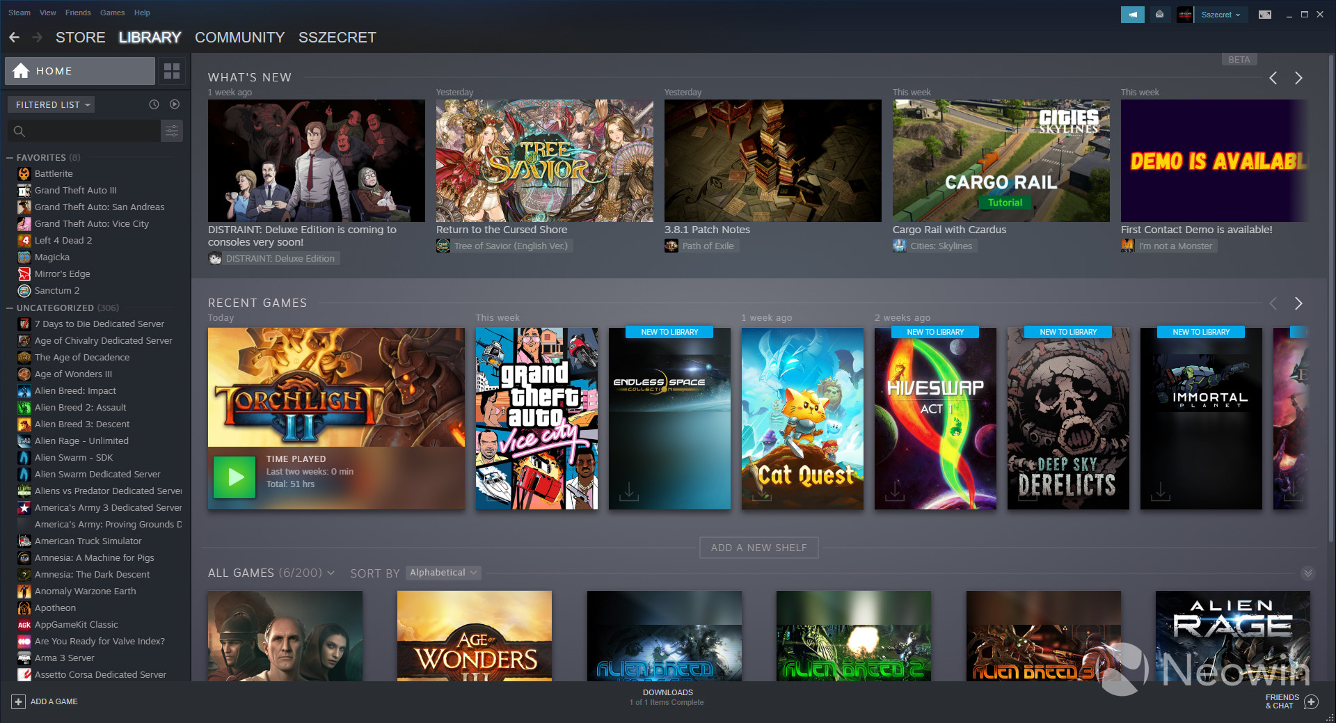
One of the most noticeable changes is a new default view, dubbed Home view. Unlike the previous UI, which showed the game page of the title you played last, the Home view shows off different bits of news relating to the games you own, a section of recently played titles so you can quickly jump back in, and then a series of customizable sections called Shelves. These can display either your favorites - which is a bit redundant given the sidebar on the left -, games from a specific collection you've created, the games in your library that are not categorized, all your games, or a view of the different collections you've put together.
To make it easier to get into the games you want, there's also an install shortcut in the bottom left-hand corner of the artwork. Rather weirdly, there's no shortcut to play the game if it's already installed, though you can simply right click and hit play that way, without needing to go to the title's dedicated page in your library.
As far as scaling goes, there are options to have Library elements that are small, medium, large, or elements which scale automatically depending on the window width. Each of the aforementioned shelves displays six titles at 1080p or five titles if you shrink the client to its smallest size.
For those who want to squeeze as much performance as possible from the application, there are two other options in the Library section of Settings: low bandwidth and low performance mode. The first one disables auto-loading of community-generated content in a game's dedicated library page, while the second disables things like blur effects in the background or certain gradient accents for Collection tiles. We'll go into more detail about Collections in just a bit.
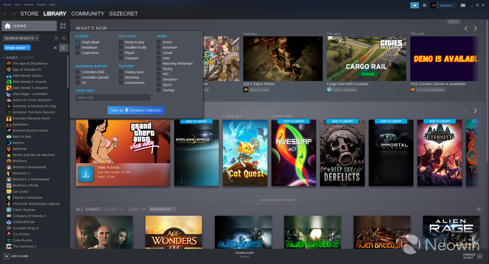
If you want to search for a particular game for example, you can make use of filters to really drill things down to what you need. Number of players, supported features, hardware compatibility, genre, and even play state filters make looking for a game a lot easier. A particularly nice addition is the ability to only show games that you've played or those you haven't played. It doesn't make the backlog any less daunting, but it is useful. Also useful is the ability to create a so-called dynamic collection right from the filtering pop-up.
There is, in addition, a more basic filtering option which allows you to show or exclude specific categories of products from your library - like software or videos -, as well as giving you the ability to display your games either in groups or in one giant list, organized in alphabetical order. This previously mentioned list can also be ordered by recent activity or depending on whether the games in the library are ready to play. To qualify for that last one, a game needs to either be installed on the local machine or be streamable from a different device. You can enable both the ready to play and activity sorting options simultaneously or separately. You can check out these features in the gallery below.
Steam Library UI (Beta) - Home view


Since we touched on them a few sentences earlier, it's worth going into a bit more detail about Collections. These are methods through which you can categorize your library, methods which are broadly similar to the way in which tags worked in the previous UI, only there's now a twist. You can create plain-old normal collections, as well as dynamic ones. The latter type can be created by ticking various filter boxes and adding a specific tag. The end result is that this type of collection expands automatically when it detects that you have added more games fitting the selected tags.
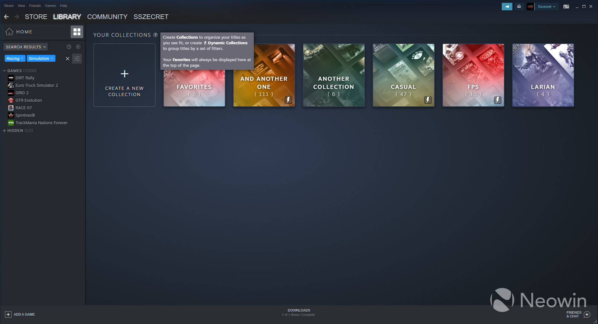
The rather interesting thing about collections is that each tile receives this colour gradient on top. Which specific colour each tile gets is a bit of a gamble as certain tags get a red gradient, while others don't. Even trying to guess the colour by looking at the larger filter category (genre, hardware support, play state, etc.) won't be too reliable since there's no predictability. This added bit of visual interest is of course removed if you choose the low performance mode in Settings.
Creating a collection is as simple as dragging and dropping games into the "Create a new collection" box, and removal of said games can be done via the same method. You can select multiple games and drag them all into a collection, though multi-select to remove doesn't seem to be possible currently. The switching of views from inside a collection to the general collection view if you have a game selected is a bit fiddly, though not too difficult.
The collections themselves can be sorted in alphabetical order or by which friends are playing, how many hours you've played, the last time you played a specific title, its release date, size on disk, or Metacritic score. These same sorting options are available for the shelves in Home view.
In case a specific game doesn't have the right artwork or the cropping of the selected box art is bothersome, you can add your own custom artwork. You can check out the various aspects related to Collections in the gallery below.
Steam Library UI (Beta) - Collections


Beyond these two sections, the game landing pages have also received an overhaul with bigger splash art, a different way of displaying community content and other relevant features like achievements or trading cards, as well as direct links to the collections which they are part of. Also helpfully displayed are the specific features the game supports like single player, multiplayer, controllers, and so on. If you require more information, the little "i" icon reveals info like a short description, the developer and publisher, release date, and an explanation of the feature icons seen in the lower right-hand corner of the splash art.
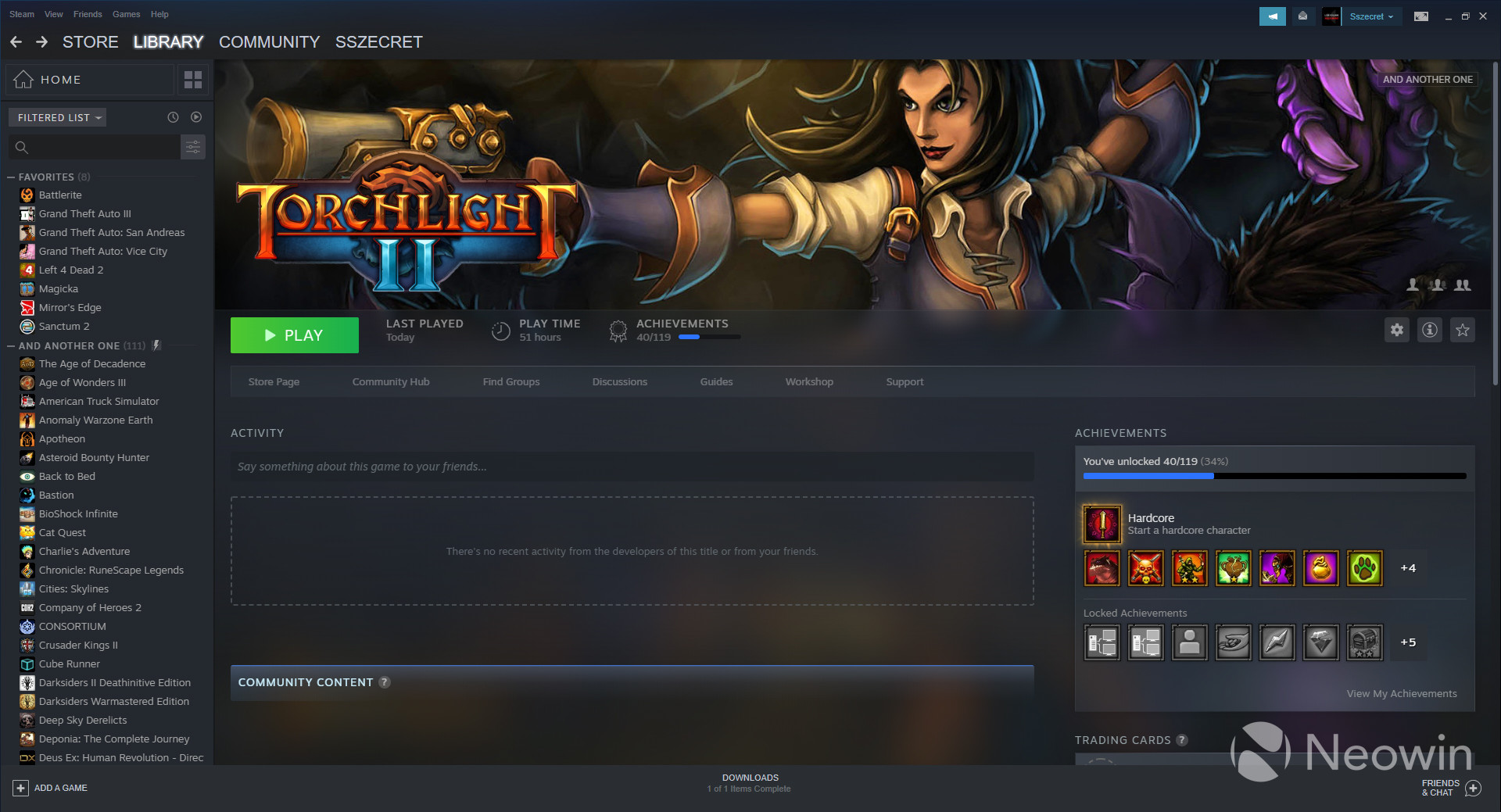
Keep in mind that while the download progress bar that's be displayed next to the big install button (replaced by the play button once your game is ready) has received an overhaul, the actual download page remains the same. Feel free to take a look at some other aspects of the game page in the gallery below.
Steam Library UI (Beta) - Game page


In terms of quality of life improvements, there's a rather nice "scroll to the top" option in pretty much every section of the new UI, from the game page itself to game list on the left. This is a small detail, but nonetheless quite handy.
Last but not least, there are also updates for developers, updates which are mostly to do with game presentation and tools for events and announcements, seeing as the refreshed UI takes more advantage of imagery.
It goes without saying that because this is a beta, issues are definitely going to crop up, but if you're willing to put up with them, there are two ways to get this UI. Either join to the beta via this link, or go to your client, Steam > Settings > Account, and under Beta participation hit change and swap from "NONE - Opt out of beta programs" to "Steam Beta Update". Here's the changelog for the latest build released:
General
- We're pleased to announce that the New Steam Library is now available in open beta – all players can opt-in and try out the new features.
SteamVR
- Added playtime tracking for SteamVR workshop items and for SteamVR itself
- Titles that are hidden in the Steam Library will now be hidden in the recently played UI in SteamVR Home
Linux
- Fixed a problem where the screen could go to sleep while using a controller
- Fixed cases where the on-screen keyboard would steal focus
- Added support for enabling the Big Picture overlay when using controllers with the desktop client
Unfortunately, the more social-centric capabilities detailed previously by Valve like showing off of the games your friends are playing in Home view do not seem to be present in this build. It's unclear whether this is a bug or if it will be added a tad later.
In case you're interested what's happening on the other side of the fence, GOG released an update to its upcoming Galaxy 2.0 launcher a few days ago. You can take a look and see which design or feature set you prefer.
What's you opinion on the Library UI overhaul? Sound off in the comments below!


30 Comments - Add comment