The starting date for Windows 11's staggered rollout is only a couple of days away, and hopefully, you've been following along to our in-depth coverage of the OS to find out what's new. We have also been discussing specific Windows 11 features in dedicated articles via our ongoing Closer Look series.
So far, we have taken a look at Search, Widgets, the Start menu, Snap Layouts and Snap Groups, the Taskbar, quick settings and notifications, Virtual Desktops, power and battery settings, default apps configurations, File Explorer, context menus, Teams integration, and the updated Clock app in Windows 11. Today, we'll be discussing the revamped Microsoft Store in Windows 11, that is actually coming to Windows 10 too.
For the purpose of this hands-on, we'll be taking a look at Windows 11 build 22000.194 that was released to the Beta Channel a couple of weeks ago versus a publicly available and up-to-date Windows 10 (version 21H1 build 19043.1237). While the OS is still under active development, given that we're nearing the launch date of Windows 11, it's a bit unlikely that the feature-set we talk about get massively revamped by the time of its general release.
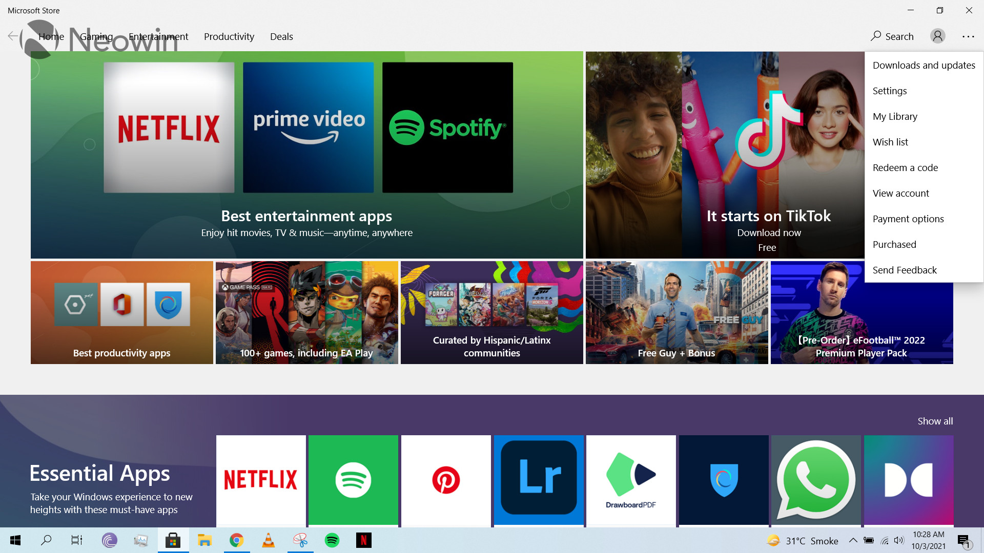
As stated previously, the new Microsoft Store is coming to Windows 10 too, but since that has not happened yet, it makes sense to discuss the storefronts present in the two operating systems separately. Starting off with the launch experience, it's fairly straightforward. You get a landing page that shows you some highlighted apps in a carousel, but you can also shift between different categories using the pane at the top.
You can add a work or school account by clicking on the profile symbol on the top-right and use the three-dots menu next to it to access a variety of configurations such as Downloads and updates, Settings, Library, and Wish list, among other things.

Talking about specific options available via the three-dots menu, I must say that I'm not a fan because they waste too much space. A prominent example of this is the Settings menu shown in the screenshot above. You can't expect me to believe that this is really the most space-efficient way to show this information.
In the same vein, "Purchased" launches a webpage to show you all the apps that you have bought. I just don't understand why this information can't be presented inside the Microsoft Store app. It makes for a very jarring experience and I don't really like the fact that I have to sign in from my browser just to see the apps I have spent money on. The same thing happens when you click on "View account" or "Payment options". I'm not sure if this is due to some security reasons or something else, but overall, it just results in a bad user experience.

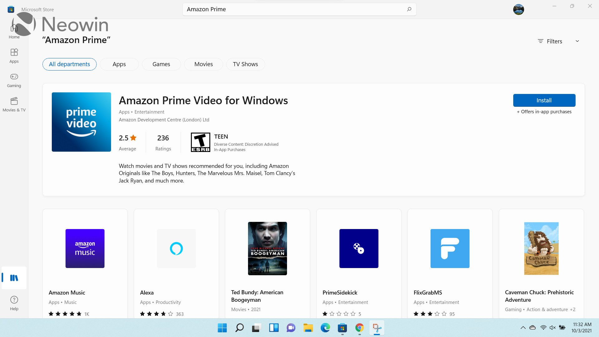
In terms of the end-user experience, the search functionality is easy-to-use. You simply type in your search item, after which you'll (hopefully) be shown relevant results. You can use the filters at the top to further restrict results to different "departments" - which are essentially categories - or the type of device you are using. There is no context menu to install an app directly from the search results, you have to visit its dedicated store listing by clicking on it.

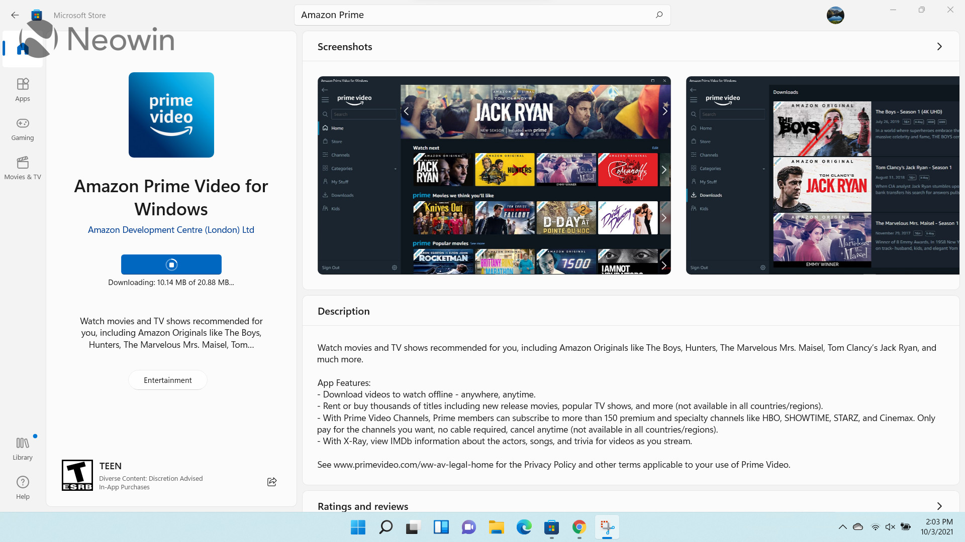
Talking about the dedicated store listing, most of the space is taken up just by a huge banner for the app, the app's description and rating, and a few other options such as Wish list, and Install. I've always found this to waste way too much space as you have to scroll down to view the actual reviews, detailed descriptions, screenshots, system requirements and more even though there is tons of wasted space at the top. It's a very inefficient UI.
I'm not a big fan of the download information shown too. Maybe this is just me, but I'm not used to being shown download speeds in Kb/s or Mb/s instead of KB/s or MB/s respectively. If an app's download size is 8MB, being provided the download speed in MB/s makes calculating and estimating the remaining time needed to download an app is much easier for me. Under the current implementation, I have to perform an intermediate step of converting Mb/s to MB/s before I can estimate how much time is remaining. It's just a personal grievance I have with the app, and I don't know if anyone else feels the same way.

Coming over to the Microsoft Store in Windows 11, you'll notice that the landing page has been completely revamped. The carousel promoting highlighted apps is much more prominent and less cluttered. The categories pane at the top has been done away with, which doesn't bother me much because I typically relied on the search functionality to find the apps that I wanted anyway.
There are some very nice acrylic effects, transitions, and animations when your hover your cursor over certain UI elements such as the collections at the center of the screen or the "See details" button. The Microsoft Store's new design and development is being driven by Rudy Huyn, and the quality shows. Long-time fans may remember him as the star developer behind several stellar third-party clients for Windows Phone apps such as 6tag and 6snap, when companies refused to support the OS.
The three-dotted menu has been done away with and options have been moved to either the profile icon or the pane on the left. Unfortunately, "Manage account and devices" and "Payment methods" still launches a webpage separately. I really wish Microsoft think of a better approach for this.

That said, I am pleased to say that almost the entire Settings page now fits on the screen of my device without having the need to scroll, unlike Windows 10. Space is much better utilized and it's clear that Microsoft recognizes that its existing UI for Windows 10 is not that good. There's still a lot of whitespace but I don't mind it because separation is better and everything you would want fits in a single screen.
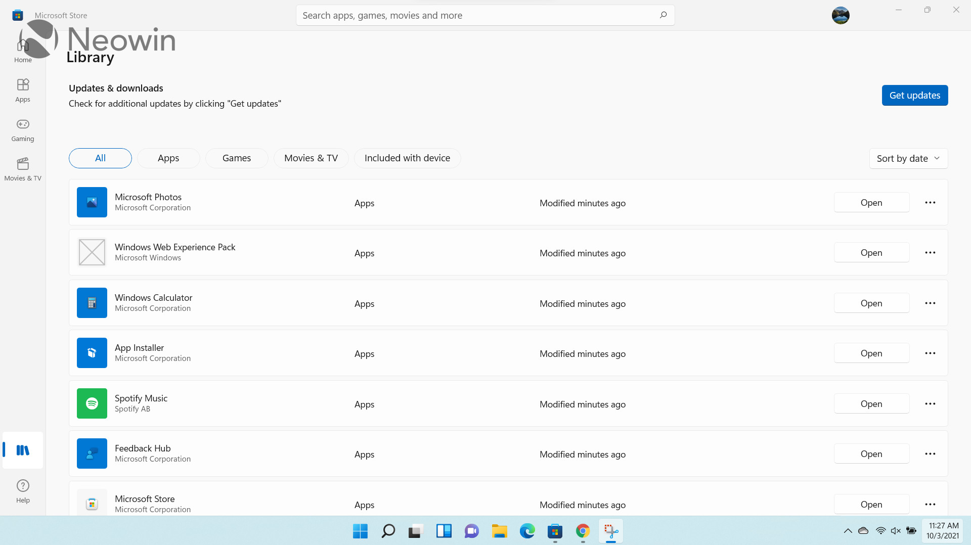
The Library page has received a redesign to and now utilizes most of the width of the screen. There's still a lot of whitespace, but again, I feel like this to contributes more to the neat look of the UI and should not be considered a flaw. You don't need to have your screen cluttered with all sorts of information, most of which will likely be useless. You can click on the three-dotted menu to access further options such as sharing the app or pinning it to the taskbar. I would like slightly more information such as the installed size of individual apps, but the lack of this data is not a deal-breaker for me right now.
Unfortunately, it's still not possible to uninstall apps from this Library page, which I think is a pretty big miss in terms of user experience.
The search experience has received a very noticeable upgrade. First of all, a full length search bar has been added to the top-center of the screen. This aligns really well with Microsoft's vision of a center-aligned UI for Windows 11, as we have noticed in the default taskbar experience too. Even apart from that, I think this should be the natural place of a search bar, rather than being a small icon on the top-right of the screen, like in Windows 10.
The UI for search results is much more sophisticated too. The most relevant result is surfaced prominently at the top and you can install the app from right there without having to go to its store listing. Other possibly relevant apps are shown at the bottom but you can still see them without scrolling so while the surfaced app definitely has an advantage, it's not that big because other relevant options can be seen at the bottom too. There are some handy filters at the top already but you can also click on the "Filters" option on the top-right to see more advanced options. I really like this revamp.
Finally, the store listing page has received a major redesign too. The information that occupied a lot of space in the Windows 10 Microsoft Store has been moved neatly to a pane on the left. Meanwhile, all other important information such as detailed descriptions, screenshots, and detailed ratings and reviews have been moved to the right. I think this is a major improvement over its predecessor as it utilizes space much more efficiently and shows you lots of important information without having the need to scroll.
Unfortunately, download speeds are still measured in Kb/s and Mb/s, and are visible when you hover your cursor over the "Downloading..." area, but I suppose that this is just something I have to get used to.

Lastly, it would be unfair not to talk about app support when it comes to the Microsoft Store in Windows 11. The storefront has been making great strides in getting developer and app support recently. This is primarily due to the fact that it is now open to all applications, regardless of the framework or technology used to develop them. This essentially means that developers can publish Win32, .NET, UWP, Xamarin, Electron, React Native, Java, and Progressive Web Apps directly to the storefront, and will be responsible for its update mechanism. We've recently seen PowerToys, Microsoft Edge, Visual Studio, and Visual Studio Code all make their way to the digital storefront.
Tons of other apps including storefronts like the Epic Games Store and competing browsers such as Opera and Yandex Browser are on the way as well. It is also important to note that the Redmond tech giant does not deduct any revenue if a developer chooses to utilize a third-party commerce system instead of the standard one offered by Microsoft.
Now that we've talked about the enticing benefits offered by the Microsoft Store, I feel that it's important to address the elephant in the room too. I'm talking about the current lack of Android app support. When Microsoft officially announced Windows 11 back in June, it made a big deal about Android app support in the OS, courtesy of a partnership with Amazon. However, as we later found out, this arguably huge capability will not be present in the October 5 release of the OS.
Given the fact that Android app support is not currently even present in the Windows Insider Preview channels, and the only information that we have from Microsoft is that it's coming "soon", one can't help but be a bit disappointed about this major miss. Having this ready by the time of Windows 11's general availability would have been a major win for the OS and would have helped put it on the map, an area that we have seen Microsoft struggling in. It is what it is though. Seeing that Windows 11 will receive one major feature update per year, it's unknown whether Microsoft will ship bits for this via cumulative updates or whether we will have to wait a whole year until native Android app support on Windows becomes a reality.
Regardless of that, I have to emphasize that I really like the current implementation of the Microsoft Store in Windows 11, and I think it's great that those on Windows 10 will be able to take advantage of the front-end enhancements soon too. The revamp is quite major and even though I wouldn't call it perfect, it's important to note that updates to the Microsoft Store are not tied to OS updates so it will undoubtedly get better with time. Microsoft's policies when it comes to openness and ease of distribution via its storefront will likely entice many developers. If the Microsoft Store had shipped with Android app support, I can't help but feel that Microsoft could have knocked it out of the park with marketing, but that's not really a flaw of the front-end implementation, which I think is superb - barring a few minor issues.
Take a look at the section here or select from the links below to continue exploring Windows 11 in our ongoing "Closer Look" series:
- Closer Look: Search in Windows 11
- Closer Look: Widgets in Windows 11
- Closer Look: Start menu in Windows 11
- Closer Look: Snap Layouts and Snap Groups in Windows 11
- Closer Look: Taskbar in Windows 11
- Closer Look: Quick settings and notifications in Windows 11
- Closer Look: Virtual Desktops in Windows 11
- Closer Look: Power and battery settings in Windows 11
- Closer Look: Default apps settings in Windows 11
- Closer Look: File Explorer in Windows 11
- Closer Look: Context menus in Windows 11
- Closer Look: Microsoft Teams integration in Windows 11
- Closer Look: Clock app in Windows 11


12 Comments - Add comment