Adobe this week unveiled their latest creation with the announcement of Creative Suite 5 and with it came revelation of the latest design and branding they are employing for the new software suite.
Shawn Cheris, Lead Designer of the Desktop Brand team, provided some background information into the process that goes into designing the branding and presentation for each product launch and provided a look through Adobe’s history of splash screens.

The branding team begins work for each Creative Suite iteration about a year and a half before the estimated launch. This process typically precludes any of the marketing work for the products, so the team has to start from a clean slate. The team designs everything associated with the presentation of the software: splash screens, application icons, graphics during the installation process, file icons—the whole nine yards. In the end, they come close to creating about 10,000 different assets for each release.
Cheris also explains how the design team had to take a 180 for the Macromedia merger in 2005: “When Adobe and Macromedia merged in 2005, the Brand Team was faced with a challenge: how to merge dozens of disparate product offerings from two companies into one cohesive system—practically overnight. Botticelli's Venus simply wasn’t going to work anymore. We needed something simpler—something more systematic and extensible."

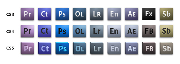
"Under designer Ryan Hicks, a new system was born. Using color as a primary reference point and representing apps by a two-letter mnemonic, the Brand Team implemented a system that was both beautiful and functional. Users could easily distinguish one application from another at even the smallest sizes—a real challenge at times with the feathers and starfish icons of the early CS systems. At the time, the user community had mixed reactions, but over the years, the new system has proven to be immensely popular. We have watched with joy and amusement the appearance of countless imitators and fun surprises like hand-made CS3 pillows."
For CS5, the branding team wanted to tread past the traditional “monolithic” design established from the Macromedia merger while still keeping the new color system intact since users had sorely missed the eccentric and dynamic designs of previous Adobe software. Inspiration for the new branding came from a diverse range of sources: “Otl Aicher’s work for the 1972 Munich Olympics, traditional drawing tools, machined metal surfaces, Swiss design, lithographic advertising posters of the early 1900s, and more."

CS5’s presentation is based around a new grid system to ensure that they wouldn’t just be outputting rectilinear elements for the applications. The base grid was used as a foundation to create more diverse and complex shapes.


And the resulting splash screens:

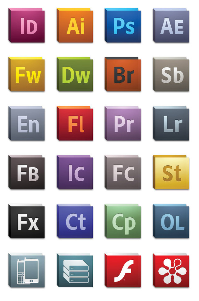
The new icons continue the traditional color differentiated approach established from CS3 but now employ two main colors per application. Cheris explains how this small change has "substantially increased the visual differentiation between product icons, making it far more usable for customer who have a multitude of Adobe applications installed on their system."

And the final product(s):

Image credit to Sebastiaan de With and Neven Mrgan.
Gallery: CS5 branding


70 Comments - Add comment