Google has been reportedly working on a Gboard redesign for some time now and the company has finally started rolling it out to select beta testers. In the new look, Google is replacing the Roboto font with Product Sans for the characters on the keyboard which gives the new design a cleaner look. Google has also done away with the gray background, replacing it with white, and given the keys a gray tint. The shift, backspace, number switch, and enter key have a slightly darker gray tint to make them stand out from the other keys.
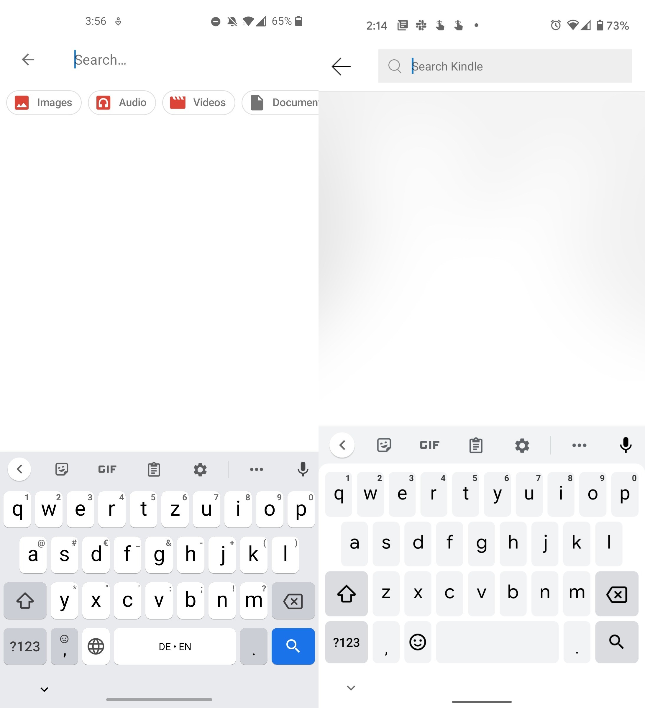
The dark theme has also received similar changes which now has a completely dark background and gray keys. From a feature and usability viewpoint, there's no change on that front.
From the screenshots, it looks like Google has also removed the long-press symbol guides in the new design to achieve a cleaner look, though an option to restore it could be buried in the keyboard settings.

Google is rolling out this new redesign as a part of a server-side switch for Gboard beta testers and this seems to be an A/B test so not all beta users will get the new look. Nonetheless, this does mean that we should see a Gboard redesign rolling out to more users pretty soon.
Source: Android Police
What do you think about the new Gboard redesign? Let us know in the comments below!


11 Comments - Add comment