
Google Play Store is set to get a design overhaul in the near future and some of the images of its pre-release version have been published online.
At the Google I/O event in June, Google announced its vision of unifying the user experience across platforms using the "Material Design" language. With a focus on typography, modern colours and flat icons, Google is aiming to make it easier for developers to make applications for devices ranging from smartphones to televisions using same designs.
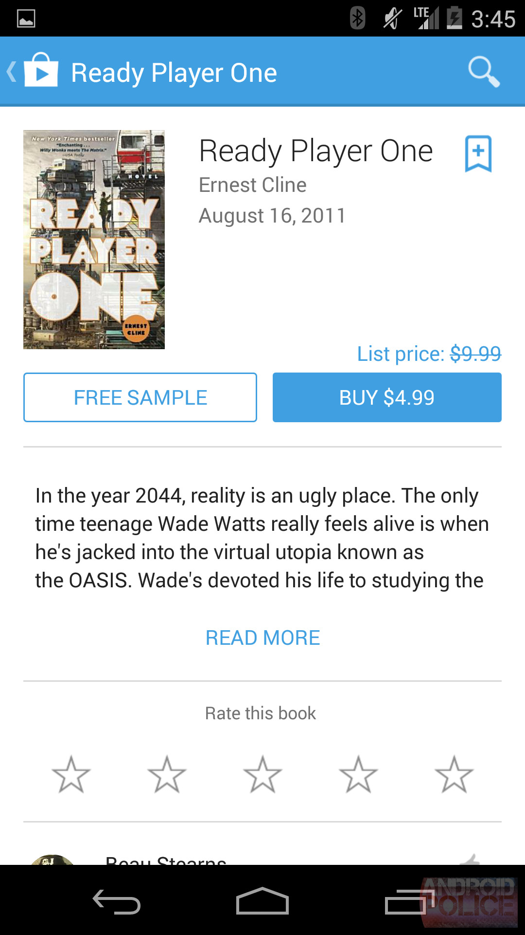
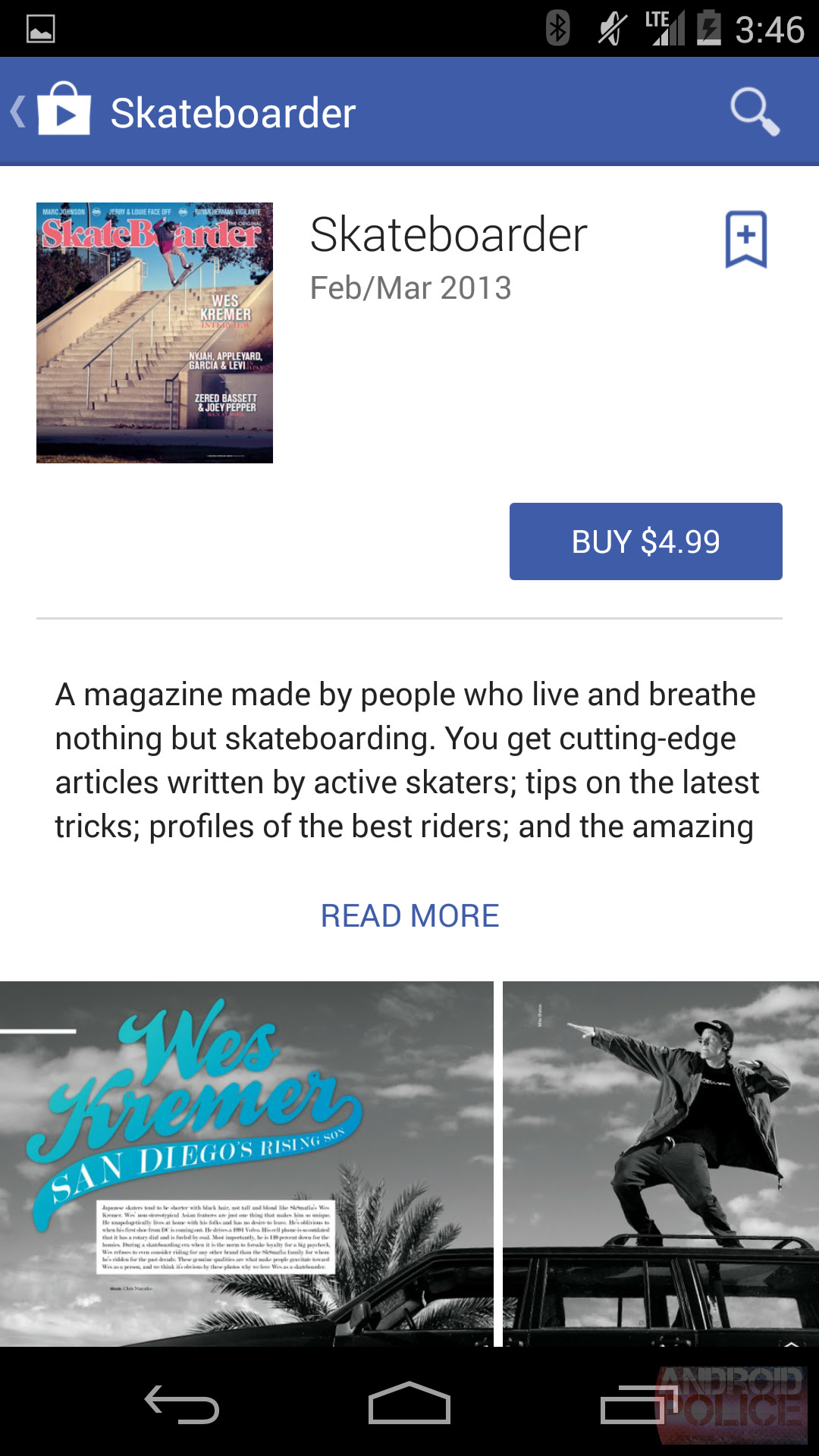
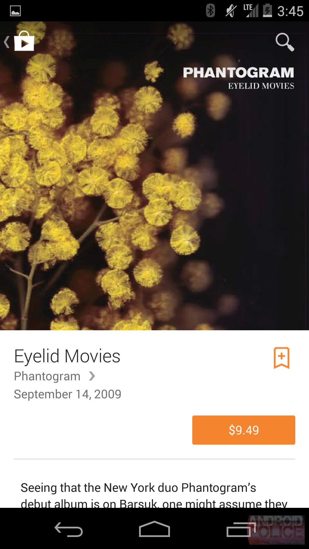
Now, one of the first major applications that would get a taste of "Material Design" has been revealed by Android Police, and it is the Google Play Store, which is an important part of the Android ecosystem. The images published by the website show that the app will adapt to the content that the user is currently looking at and accordingly set a cover image or a related video for the content's page. It should be noted that Material Design, also includes the use of some animations and 3D views which cannot be depicted by these images.
In landscape mode, the Google Play content is shown front and center like modern blogs and websites, with content immediately shown below, rather than in a separate window pane as before. The portrait mode, generally used on smartphones, still looks a bit like the previous iteration but we can hope to see many changes by the time Google releases Android L.
Source: Android Police | Image via Android Police
Gallery: Play Store Material Design


44 Comments - Add comment