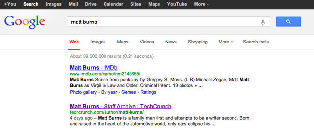
Google has finally started to roll out a new search result design that was first spotted way back in June. The revamp is notable for a couple of reasons, one it is a relatively small change as it has made its previous vertical menus now horizontal and the other is that it looks exactly like Bing's menu.

Before (top) / After (bottom)
Yes, we understand that there are a finite number of modifications you can make to a search layout, but this change would appear as if Google saw what Bing was making in its kitchen and decided to bake a similar cake for the market share competition.
Google started testing this design back in June but Bing rolled out its update about a month before Google began testing the layout. Clearly they must have liked the extra space the new menu placement provides as it is now the default layout for the search engine (or will be soon as the new page rolls out).

Google has taken a cue from Bing, it's the way design works if you get the implementation right, as it's easier to copy than to create. But we would rather Google try something new, rather than follow in the footsteps of what Bing has already created as they clearly have the resources to think outside the (search) box, right?
Source/Image Credit: Techcrunch.com


65 Comments - Add comment