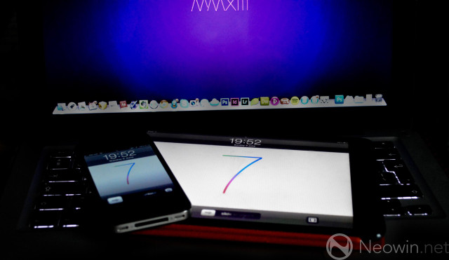
It's Monday, which can only mean one thing. Apple's WWDC conference kicks off later today in San Francisco at 10:00 AM PDT (13:00 PM EDT, 18:00 PM GMT). Yesterday we believed Apple's next mobile OS had leaked in the form of some anonymous images, but we later learned it was all an elaborate hoax.
Today, however, 9to5Mac's Mark Gurman has posted some images based on the "quick peek" of iOS 7 he claims to have been given. Gurman tells us he's not been allowed to post direct screenshots due to source confidentiality, however another staff member has mocked up some designs based on Gurman's descriptions.
I've been given a quick peek at an early beta of iOS 7 and can only describe what I've seen. I'm told I can't post the screenshots because Apple embeds little watermarks that could land the source in some trouble.
Gurman goes on to note that the typography in the OS is similar to that seen on the WWDC banners we've already seen:
The whole OS has that 'skinny jeans' Helvetica Neue Ultra Light [or similar] that you've seen in those posters. At the top, instead of carrier signal bars, Apple now has 5 dots that are white or gray to represent the signal.
Below are the mockups that have been created based on Gurman's descriptions.

If these mockups are close to reality, it's clear that the team led by Jony Ive have opted to flatten the interface considerably, as we expected.
Gurman comments that these mockups "closely match" what he believes we'll see later on today. He also makes reference to each app having an alternative colour scheme, intelligently changing based on ambient light, or indeed the colour of your device. Similar to the volume slider on iOS 6 that simulates the reflection of light depending on what angle you hold it at, iOS 7 will "shift slightly based on external factors", Gurman believes.
Here's the full mockup of the home screen:

Whilst this information, if true, gives us some great insight into an early beta of iOS 7, it doesn't detract from how awful it looks. Check out that Safari icon; it looks like a damn thermostat.
Let's hope that either the mockups aren't remotely close to the final version, or that this is an elaborate ruse to keep us on our toes.
WWDC kicks off later today, where all our questions will be answered. If Apple decides to post a livestream as it has done in previous years, we'll be sure to post a link up for that. If not, you can still follow all the important coverage on Neowin when the conference kicks off at 10:00 AM PDT (13:00 PM EDT, 18:00 PM GMT).
Source: 9to5Mac | Mockups via 9to5Mac


70 Comments - Add comment