Ubuntu will soon begin to phase out its traditional "system tray" in favor of a new overhauled menu and notification system. Citing inconsistent behavior and weak notification ability, the Canonical Design Team has announced that the current notification area will be dropped in favor of more consistent and user friendly status menus.
The problem: A weak and inconsistent notification area
To explain its decision, the team went back to the origins of the current notification area that many operating systems incorporate. Originally conceived in Windows 95, the notification area began its life as a place to see the time and adjust the volume, but soon started to become known as the “system tray” as Microsoft allowed developers to use “systray.exe" for their own applications.
![]()
As much as Microsoft has tried to dispel the term “system tray” in favor of “notification area", the Ubuntu team cite two main reasons for it still being used. The first, as stated above, developers are able to use the notification area for uses that aren’t even notifications (such as hiding an application to its tray icon). For the second, they state that the use of extremely small icons do not effectively alert the user other than small case scenarios such as “you have new mail” or “your battery charge is at 10%”.
Microsoft’s solution to the second problem came with the Windows 2000 and the introduction of notification balloons. While they did provide more detailed and noticeable notifications, the balloons floated on top of other windows "regardless of whether you need to pay attention to them right now”. Canonical addressed this issue by incorporating Notify OSD bubbles as a replacement for notification bubbles. Notify OSD presents translucent bubble overlays which can be clicked through so that the active content isn’t blocked. Multiple notifications through this system can also be queued by the software to prevent flooding.
Notification balloons vs Notify OSD


Going back to the first issue, third party developers today have exacerbated the situation by needlessly adding their application icons into the notification area. Applications such as VLC and Pidgin store an icon in the notification area for non-notification purposes. These applications usually provide a “system tray” icon as another means of hiding the application to avoid taskbar clutter, but Ubuntu is taking a strong hand approach to end this behavior as it introduces conflicting window management conventions.
![]()
Application icons in the notification area also introduce further inconsistencies in the way that they handle mouse clicks: "some items open a menu on left click, some open a menu on right click, some do both, some open a window, and at least one reliably disappears when you click it. It’s hopelessly inconsistent — and as long as we continue with the current protocol, it always will be inconsistent."
The solution: Nuke the entire site from orbit — it’s the only way to be sure
The Ubuntu team has been progressively depreciating the traditional notification area since 9.04 Jaunty Jackalope. In 9.04, new software updates were presented by just launching the updates window rather than alerting users through the notification area. In 9.10 Karmic Koala, the transition to a new menu system was introduced with a new universal messaging menu for all chat or messaging applications to use. A new session menu was also introduced to combine the previous fast user switching menu and shutdown dialog button.


10.04 Lucid Lynx brought a new sound menu to replace the standard Gnome volume applet. Also introduced was a new “me” menu for setting instant message statuses and broadcasting to social networks like Twitter and Facebook.


10.10 Maverick Meerket will introduce some of the largest advancements to the new menu system. A new power menu will replace the standard Gnome Power Manager applet, a new network menu will replace the Network Manager applet, a new time and date menu will replace the standard Gnome clock applet, and a revamped sound menu will provide a central control area for music players.

![]()
The underlying pattern from these examples illustrates how Ubuntu is transitioning from the age old notification area to a single set menu system that integrates the OS with its third party applications.
"An e-mail, instant messaging, feed reading, or similar applications should integrate into the messaging menu. An instant messaging client should respond to status changes in the “me” menu. And a music player should integrate into the sound menu.”
Applications should no longer have an icon in the notification area for minimizing but should either integrate themselves with the new menus, use a custom status menu, or simply use the regular minimize function. When a user clicks on a menu now, he or she can just scrub left and right to switch between different menus.
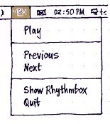
Rhythmbox, a music player, using a custom status menu
The modern comparison: Mac OS X
While there are several differences, Apple’s very own desktop operating system offers a similar menu and notifications approach that Canonical Team has outlined here. Mac OS X doesn’t include any notification balloons like Windows and instead relies on translucent notifications and the Dock for alerting the user.
When changing the volume, adjusting the display or keyboard brightness, and ejecting a disc, Mac OS X presents similar translucent confirmation bubbles; dock bounces and badges are also used to notify the user. Ubuntu’s Notify OSD provides a larger set of notifications by default that OS X users can only get through a third party application called Growl.
Mac OS X


Ubuntu


Likewise, the far right side of the OS X menubar is not a “system tray” but rather a collection of “menu extras” that provide quick access for adjusting settings or viewing at a glance information. Though there are menubar applications for OS X, the majority of standard applications do not minimize into an icon on the menubar as applications can in Windows or Ubuntu. The difference though is that because Apple does not limit the use of its menubar for third party developers, inconsistencies in window management and mouse clicks described above can be inherited depending on the app.


Ubuntu is actually taking the menu approach one step deeper though as third party applications can integrate into one universal menu. Here’s an example of the messaging menu showing access to instant messaging, email, and IRC:

And the Me Menu showing different chat and broadcast accounts as one. Users can update their status for all accounts right within a single menu:

Images courtesy of the Canonical Design Team and Wikipedia.


75 Comments
Load the comments and join the conversation!
Read the comments, ask the editors questions, show respect and join the conversation.