When Apple unleashed iOS 7 on the world, it was met with what can only be described as a hostile reception. Most users vented over the UI; it was bold, bright and colourful (possibly something Apple aficionados aren’t or simply dislike from the feedback online). One user went as far as to sue Apple for the inconvenience(s) that iOS 7 brought him and there’s even a Facebook page called “I Hate Ios7.”

So, what do you do if you’re Apple? Continue to press ahead with your current strategy, tweaking some design elements of the UI, that’s what!

iOS 7 keyboard on the left, iOS 7.1 beta 3 on the right
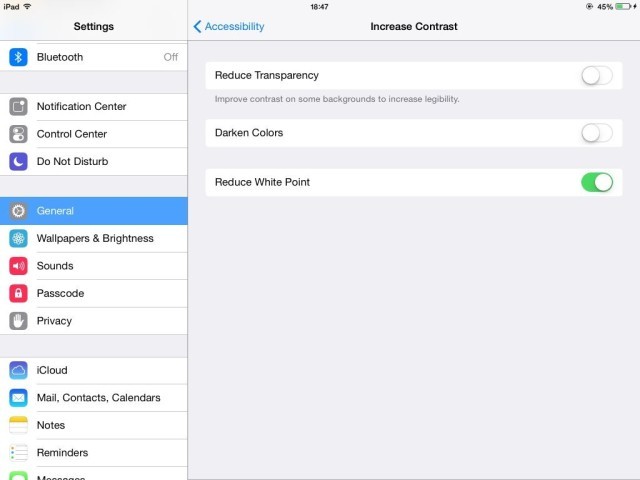
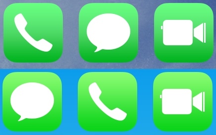
With iOS 7.1 beta 3 being released to developers yesterday, the OS has been picked apart by curious techies wanting to know what’s different. So far it’s mainly design changes that have been reported, with changes to the phone call UI, dialler, slightly darker icons and the option to 'Reduce White Point' (which apparently make the whiteness of iOS 7 a little less white).
Add this to the already implemented changes in beta 1 and beta 2, and it seems that Apple is trying to both stick with its current design roadmap and keep the end user happy. Only time will tell if the already angered user will be appeased with these changes.
So, what do we think? Have any of you used any of the iOS 7.1 beta releases, or have you been happy with the iOS 7 look and feel in the past three months? You know the drill, comment away!
Source: CultofMac | Images courtesy of Apple, CultofMac, MacRumours and iPhoneHacks
Gallery: iOS 7.1 beta 3


43 Comments - Add comment