
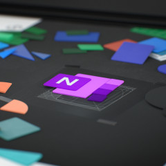
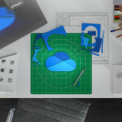
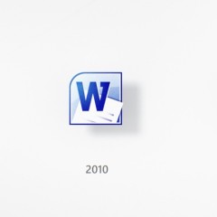
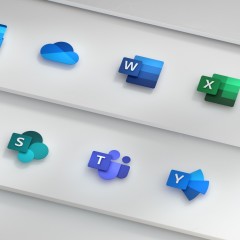
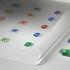
In a Microsoft Design post on Medium today, the company showed off how it's redesigning the Office app icons for the first time in five years. The last refresh came with Office 2013, and as you can see from the image above, a lot has changed over the years.
We're no longer seeing the document outlines that we had before. Now, the lines in the Word icon are meant to indicate a document, and there are green cells in the Excel icon. The idea was also to take the letter and the symbol apart. For example, on the previous icons, there was a folder shape with the letter on the front and the document inside.

Now, the letters are separate; they're still there, as is the document, and this is meant to "keep tradition alive while gently pushing the envelope". In the previous design, the letter used two-thirds of the overall logo, while the document took up a third. This has obviously changed as well.
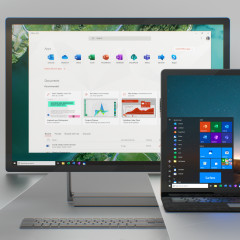
Announced alongside the new ribbon, Microsoft will finally be rolling out the new icons in the next few months, starting with the mobile apps and the web.




94 Comments - Add comment