
Microsoft is using its official Windows 8 blog site this week to talk more about its decisions regarding the operating system's new Start screen. It began with an entry on Monday and today it continued its extensive look at the Windows 8 Start screen with a a new blog entry written by Alice Steinglass, the group program manager for the Core Experience Evolved team. As she writes, "We knew that we already had a powerful launcher for desktop programs in the taskbar. The Start screen is not just a replacement for the Start menu—it is designed to be a great launcher and switcher of apps, a place that is alive with notifications, customizable, powerful, and efficient."
Microsoft is designing the Start screen in Windows 8 so that users can customize how it looks and operates. Steinglass says that Microsoft has been bringing people in to see how they would customize and organize their versions of the Start screen via different groups. She writes, "We brought a variety of people of different skill-levels into our test labs and asked them to organize the apps and websites they use frequently. The variability was surprisingly large. People did not fit all their apps into the same predefined groups, or even the same group sizes." Thus the Start screen will give Windows 8 users a ton of different options to naming groups along with the size and number of tiles that are associated with each group. While the Windows 8 team considered using folders, Steinglass states, " ... our experience with folders broadly and in the Start menu tells us that folders are a way of burying things, not organizing them. Folders also make it impossible to see the up-to-date information an app might present."
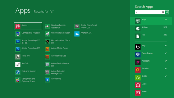
The Windows 8 team also wanted to make searching and launching apps in the operating system as simple as possible. Steinglass states, " ... we designed a search model for the Start screen where each app displays the data in an optimized format. Thus, instead of seeing just 3 results per category type (all as text), you now can hit Start, type a search term, see an entire page of app results, or continue down the list to look at the results for files, settings, email, web, social networks, or any other app on your system."
For people who believe that Windows 8 is all about the touch screen interface, Steinglass says that's not the case and that much has been done to make the operating system work well with the standard keyboard and mouse. She writes, "For mouse people, the position of the Start button in the lower-left corner of Windows 8 makes it an easy click-target (even in a full-screen app). Once in Start, more items are directly accessible to the mouse without scrolling or opening menu flyouts. For keyboard people, pinning frequently used desktop apps on the desktop taskbar enables instant shortcuts: Win+1, Win+2, etc. And, getting to less frequently used apps through search follows the existing paradigm of hitting the Windows key and typing the search term. The larger search results improve speed (both for searching and browsing)."
Images via Microsoft


29 Comments - Add comment