A while back I did a full upgrade to Windows 8 on my desktop PC, and while overall my experience with the new OS has been very positive, there are some choices made by Microsoft that hurt the experience for those using "traditional" PCs.
Now this could be a platform to rant about the Start Screen, as I'm sure many of our readers would if they were talking about what sucked in Windows 8 on the desktop, but I'm not going to. I actually don't mind using the Start Screen on the desktop, and after several hours of use I got used to the new way Windows operates without a Start menu. If you still don't like it, either suck it up, downgrade to Windows 7 or use a third-party app to bring it back.
But there are still other things that suck about Windows 8 on a desktop PC, so here they are with no sugar coating.
The Modern app switcher
First of all, if you're on a desktop machine chances are you're in the Desktop and you're using desktop apps just like you were on Windows 7. I'm currently writing this article in a desktop web browser, and I see no reason to use the majority of the bundled apps in the Modern UI, or any from the limited selection in the Store.
It's perfectly fine to leave the Modern apps alone, except for that damn app switcher that activates when you mouse into the top left corner. In Chrome I've pinned Neowin as my first tab (this is a pinned tab), so normally if I want to visit the site I simply mouse to the top left tab; but if I mouse literally 5 pixels too far it will bring up the app switcher.

Dammit, I didn't mean to open the app switcher
Now if you've opened no Modern apps at all this switcher will not activate, but it's not unusual for me to check out Xbox Music, SmartGlass or the Weather using the Modern apps. This means there is often one or two apps in this switcher for me to accidentally switch to when I don't want to, which can be incredibly frustrating and interrupts my workflow.
Then, of course, the app switcher only includes Modern apps and bundles all the desktop apps under the Desktop tile. This is completely useless to me as I might have 10 desktop apps and only one Modern app open, and the switcher won't show any of my desktop apps as separate entities.
The ideal situation is the app switcher includes desktop apps as part of the tiles it shows, but otherwise it should be disabled. Luckily there is an option hidden in PC Settings for that...
Taskbar transparency
Why did Microsoft choose to make the taskbar transparent when none of the other elements in the interface use transparency at all? Window borders are solid colors, previously transparent panels in apps are now solid colors, and any of the new Modern/Metro-style elements include no transparency.
![]()
Transparent taskbar with solid-color windows looks strange
If you can't make the window borders transparent the taskbar should not be transparent at all to preserve visual unity across the OS, but as it is currently it just looks stupid and horrible. I want an option to disable taskbar transparency so the visual improvements to the desktop are complete.
Search
If there is a feature that has definitely become worse in Windows 8, it's the search feature. Which fine gentleman decided that Apps, Settings and Files would be separated in the search results even when there are no results found. If I search for "mobile" using the quickest method (Win key and then type) of course it doesn't find any apps, but you would think instead of displaying "No results found" it would display at least some of the 121 files it found - the files I was actually searching for.
Then there's some things it simply doesn't find at all. Search for "task scheduler" and nothing comes up, but if you search for "schedule tasks" and then click on Settings it finds the appropriate function which then opens the Task Scheduler. What?! This is in no way user friendly, and makes it harder to access and find things you're actually looking for!
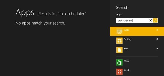
It doesn't even find the Task Scheduler under Settings
TechSpot has a great article that goes over how Microsoft made search worse in Windows 8, so I suggest you read it here.
The Charms bar
Sure, Microsoft may be looking to have design and function unity across tablets, notebooks, hybrids and desktops, but on a desktop PC the Charms bar is basically useless.
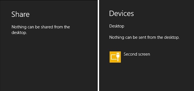
Why even show these options?
- The Devices option shows nothing but my second display
- The Share button can't do anything in desktop mode
- The Start button in Charms is the slowest way to open the Start Screen with a mouse
- Search can be more efficiently accessed by pressing the Windows key, or mousing to the Start Screen, and then typing
- The time, date and network status are already displayed in the notification area on the taskbar
- Settings displays network, sound, brightness, keyboard and notifications - all of which are either unimportant, or already displayed elsewhere
- In Settings there is a link to PC Info, a panel you don't need to frequently visit, and Personalization which can be accessed via right-clicking the desktop
There are literally two items that are useful on the Charms bar: the Power settings such as shutdown and restart, and the quick link to the Control Panel. Surely a smaller menu could have been created that removes all the rubbish and makes these functions easily accessible.
Settings are split
For some bizarre reason, in Windows 8 the settings for various things are split between the traditional Control Panel and the Modern-style PC Settings. No longer is there a central area where you can find settings for everything, instead you must search in both these places to find what you are after.
Items such as Windows Update, Ease of Access, Users and Devices appear in both PC Settings and the Control Panel, although often PC Settings does not have the same range of options as the Control Panel. Sometimes, such as with user account settings, the Control Panel will redirect you to the PC Settings menu, and then from there it might even direct you to the web to manage some areas.

One of several places that controls PC customization
Then of course there's some areas you can only change in PC Settings such as the lock screen image. Normally you might think this would fall under the Personalization settings accessible by right-clicking the desktop, where the option to change the desktop background lies, but nope, Microsoft has separated the lock screen image into PC Settings.
It would be really nice if Microsoft brought back one, central location to manage settings rather than spraying them all over the place and making it harder for desktop PC users to manage their PC how they want.
Windows Defender is hidden
In Windows 8, Windows Defender received a significant upgrade, drastically improving out of the box security. The main change is that Microsoft Security Essentials, available as a standalone product in Windows 7, has been fully integrated into Defender alongside the standard firewall. You'll notice that if you open up Defender in Windows 8, it looks essentially the same as MSE did in Windows 7.
With Microsoft Security Essentials, you knew you were protected from malware because you not only installed it, but there was a handy tray icon located in the notification area that would change colors depending on the security status of your PC. With Defender in Windows 8, all security-related notifications are hidden in the Action Center, which is not the most obvious of places.

You'd better not ignore that Action Center
Firstly, the Action Center is extremely annoying as it constantly reminds you of unimportant actions that you must take in relation to your PC, such as finishing to install software. I know I'm not the only one that completely ignores whatever the Action Center serves up, and I actually go to the effort of disabling it as a system icon in the notification tray.
Of course if you ignore the Action Center, or hide it completely, there is no way to know if your PC is potentially unprotected because the Action Center is where all Defender-related messages appear. Not only that, but end-users would probably not even realize that a full-blown free anti-malware program is running on their PC, and might unnecessarily purchase expensive third-party software, or even attempt to install MSE which results in an error.
Microsoft needs to bring back a dedicated Defender/MSE style icon into the tray, which could serve proper notifications to users surrounding the security of their PC and if any threats have been found. Then users would realize anti-virus software is already present by default, and everyone would be better off.
The first boot tutorial
There is no way to describe the first boot tutorial apart from completely inadequate. The only thing it instructs you on how to do is open the Charms bar, and as I've already said that is not a very useful menu on desktop PCs.
For desktop users upgrading to the latest OS, there are many changes that will present a usability challenge once Windows 8 boots up for the first time. The tutorial should at the very least instruct you how to open the Start screen from the desktop, and point out how the Start screen is replacing the Start menu - the main point of confusion for many people making the switch.

Yep, Charms is totally the only thing I needed to know about Windows 8
Of course there are many other things that Microsoft should perhaps detail in a tutorial, but only showing how to open the Charms bar is not even close to addressing the confusion first time users will inevitably face.
References to touchscreens
The final thing that sucks about Windows 8 on desktop PCs is that the OS doesn't seem to recognize that the PC doesn't have a touchscreen as part of the setup. There are references to touchscreens littered throughout the OS, including saying to "tap" rather than "click", and "swipe" rather than "drag". There's even a reference in PC Settings to a function desktop PCs don't have, which is swiping from the left to switch to a recent app.
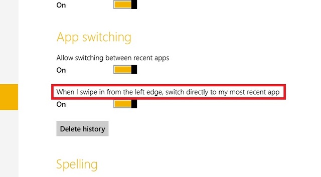
Go ahead and try to do that...
What's strange is that the short tutorial that is displayed during the initial installation refers to moving the mouse, so it has detected the lack of touchscreen, but there's still loads of references to touchscreens that shouldn't be there. This should be a simple fix, and really should have been picked up on during the beta testing phase.
Clarification: It was not my intention to blindly bash Windows 8 on desktop PCs, but rather to highlight some flaws that could obviously be fixed, and should be fixed, to improve the experience for everyone. I actually really like Windows 8 on my desktop PC, and I greatly appreciate the work Microsoft has put into improvements such as the copying dialog, task manager, improved boot performance, multi-monitor enhancements and so on. But I feel as if Microsoft hasn't fully, or properly polished the experience for desktop users like me and many others, and that is a great shame.


208 Comments
Load the comments and join the conversation!
Read the comments, ask the editors questions, show respect and join the conversation.