Over the past few years, we have highlighted several concept works that reimagine various pieces of software, including File Explorer in "Windows 12", "Windows 12.2", and "Windows Classic Remastered". Many of these are understandably divisive as they introduce major changes that look nice on paper, but degrade overall utility. Now, someone has designed a more refined version of Windows 11, or so they claim, in their latest concept.
Raditya Aryaputra on Behance has designed what a "refined" version of Windows 11 would look like, if Microsoft got rid of AI clutter, and intrusive advertisements/recommendations. This "back to the basics" approach would make the OS feel more responsive and customizable according to the designer.
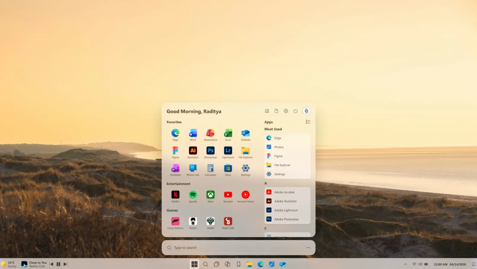
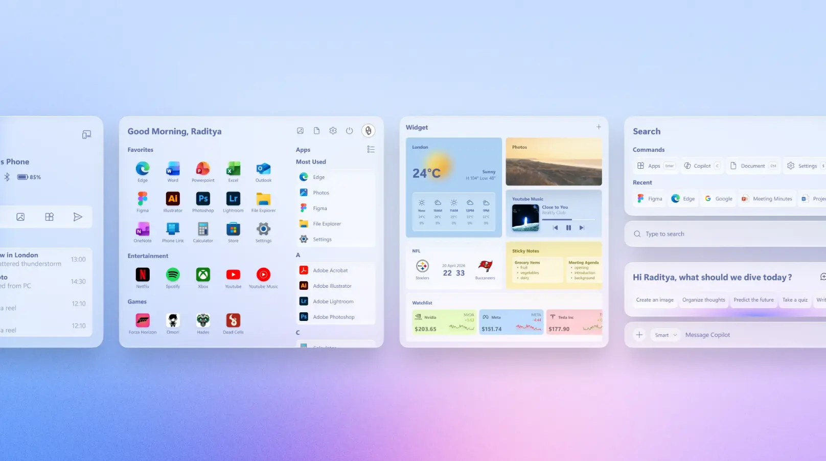
In their concept, the Start menu (pictured above) removes recommended content and just focuses on arranging your apps in categories and vertical lists. Although there is a section for most used apps, it likely isn't designed with AI recommendations in mind. You'll also notice some new icons, along with Windows Search moved to the bottom.
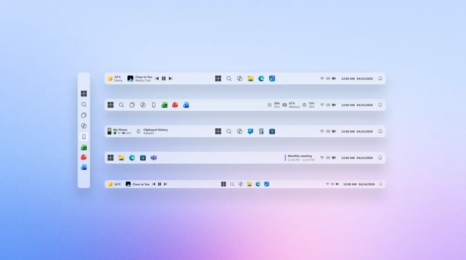
In addition, the Taskbar has been made more modular, and it now shows a lot of extra information. Of course, some details may appear overwhelming, but the idea is that it is fully customizable by the end-user.
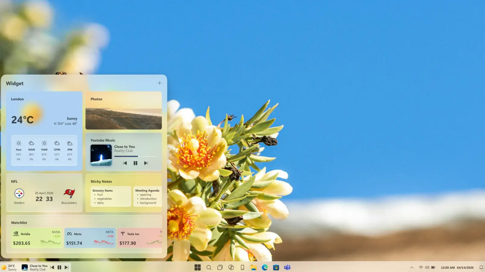
Meanwhile, the Widgets panel receives relatively minor changes and primarily gets rid of the MSN News feed section that is curated by AI.
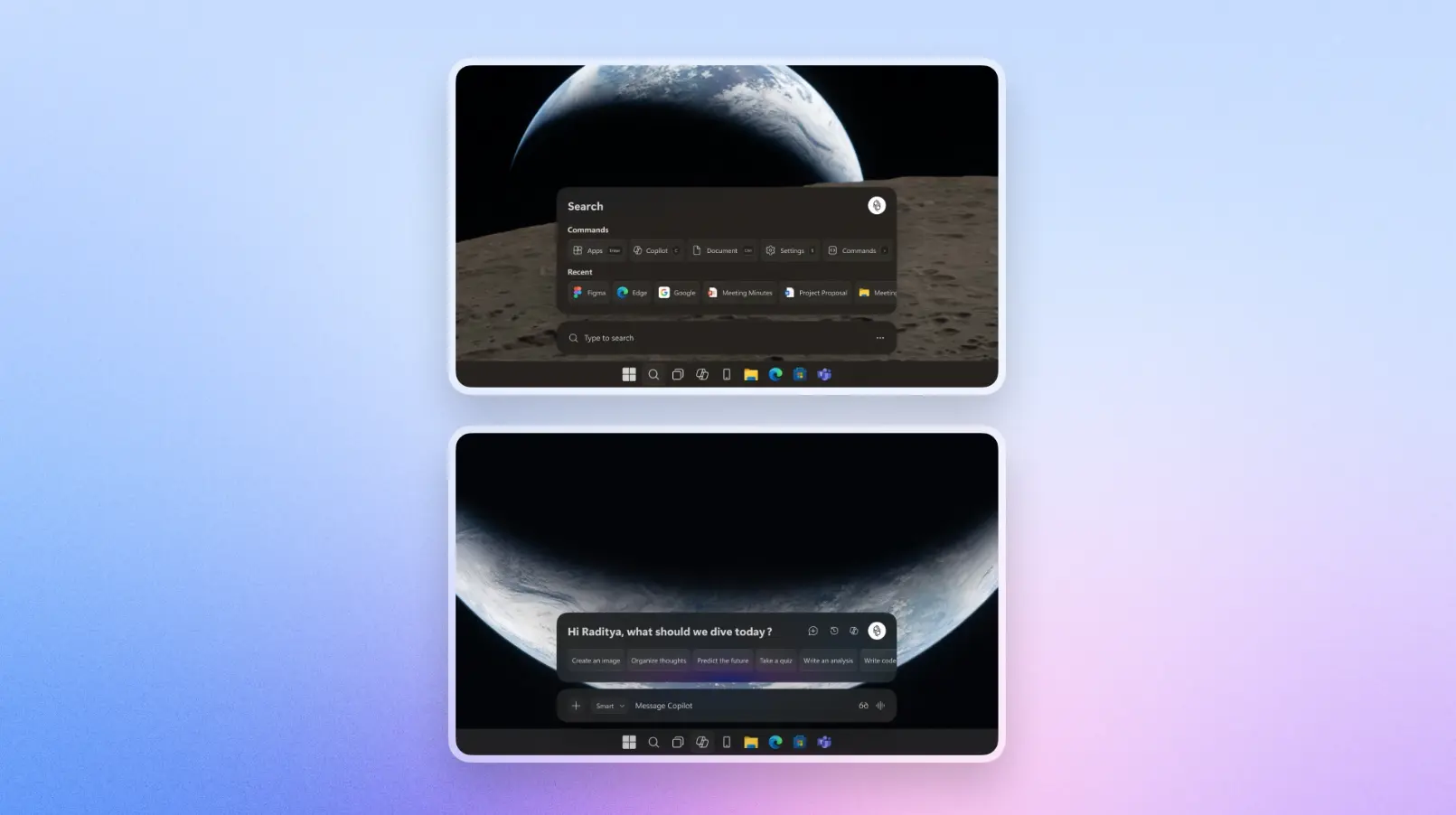
While Aryaputra doesn't decouple Copilot from Windows completely, they do make it less intrusive by mainly integrating it to Windows Search.
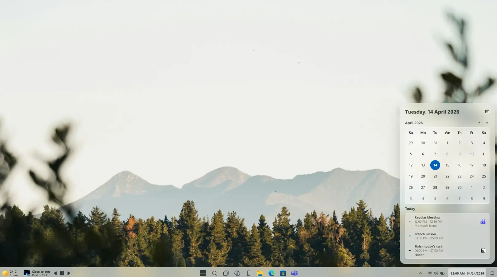
Finally, the calendar in the Taskbar is just a bit neater because it doesn't get clubbed with notifications, and just focuses on showing you its core functionalities, along with meetings.
Overall, it's an interesting concept that aims to simplify some aspects of Windows 11 and get rid of bloat. That said, some enthusiasts, including ourselves, might be on the fence with this one because of the major changes it introduces to the UX and the learning curve associated with it. Some may find the Start menu and the Taskbar to be a bit too cluttered, but we can assume that this redesign shows off the full feature-set, while allowing users to tone some elements down, according to their preferences.
At the end of the day, it is important to keep in mind that a concept is still a concept. Major redesigns like these tend to emphasize aesthetics with some usability, but usually do not possess the insights into Windows-specific user-centric design and feedback that actually goes into shaping an OS used by over a billion people globally. That said, there's no harm in imagining what a (subjectively) perfect Windows 11 could look like.
Source and images: Raditya Aryaputra (Behance)


18 Comments
Load the comments and join the conversation!
Read the comments, ask the editors questions, show respect and join the conversation.