
In the past, we have discussed many concepts created by enthusiasts, including one for Windows 11 and others for fictional versions of the operating system, like Windows 26, Windows 12.2, and Windows Classic Remastered. Naturally, some of these designs are controversial, but they do spark interesting conversations around what a piece of software could potentially look like. Now, we have another concept to share, this time focused on Windows File Explorer.
Although File Explorer is an integral part of Windows, it does have its fair share of issues. While you can improve the overall experience a bit by yourself, some people tend to resort to third-party alternatives to get the job done. Now, an enthusiast by the name of Zee-Al-Eid Ahmad (@zeealeid on X) has shared a concept for File Explorer that introduces a couple of interesting functionalities.
One of these is the ability to select multiple items from different folders. Right now, Windows 11 allows you to select multiple items either by dragging your cursor over them, or by holding down the Ctrl button and clicking items, or by simply toggling the checkbox when you hover over items. However, this action is limited to items in the current directory only. There is simply no easy way to multi-select tiems from different folders.
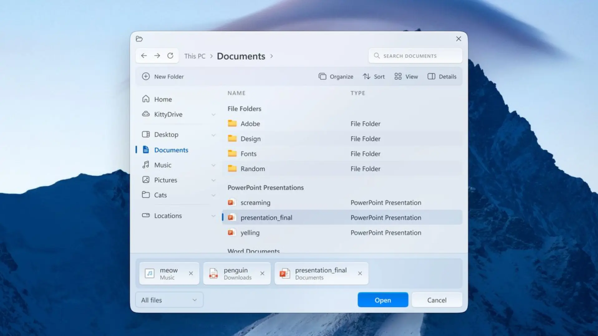
Ahmad's concept works around this problem by allowing you to select multiple items and by introducing a panel at the bottom of the File Explorer showing you the files that you have selected so far and their respective locations. Ahmad does not explain how these items are selected, but he does have a "x" icon next to each file, allowing you to de-select it.
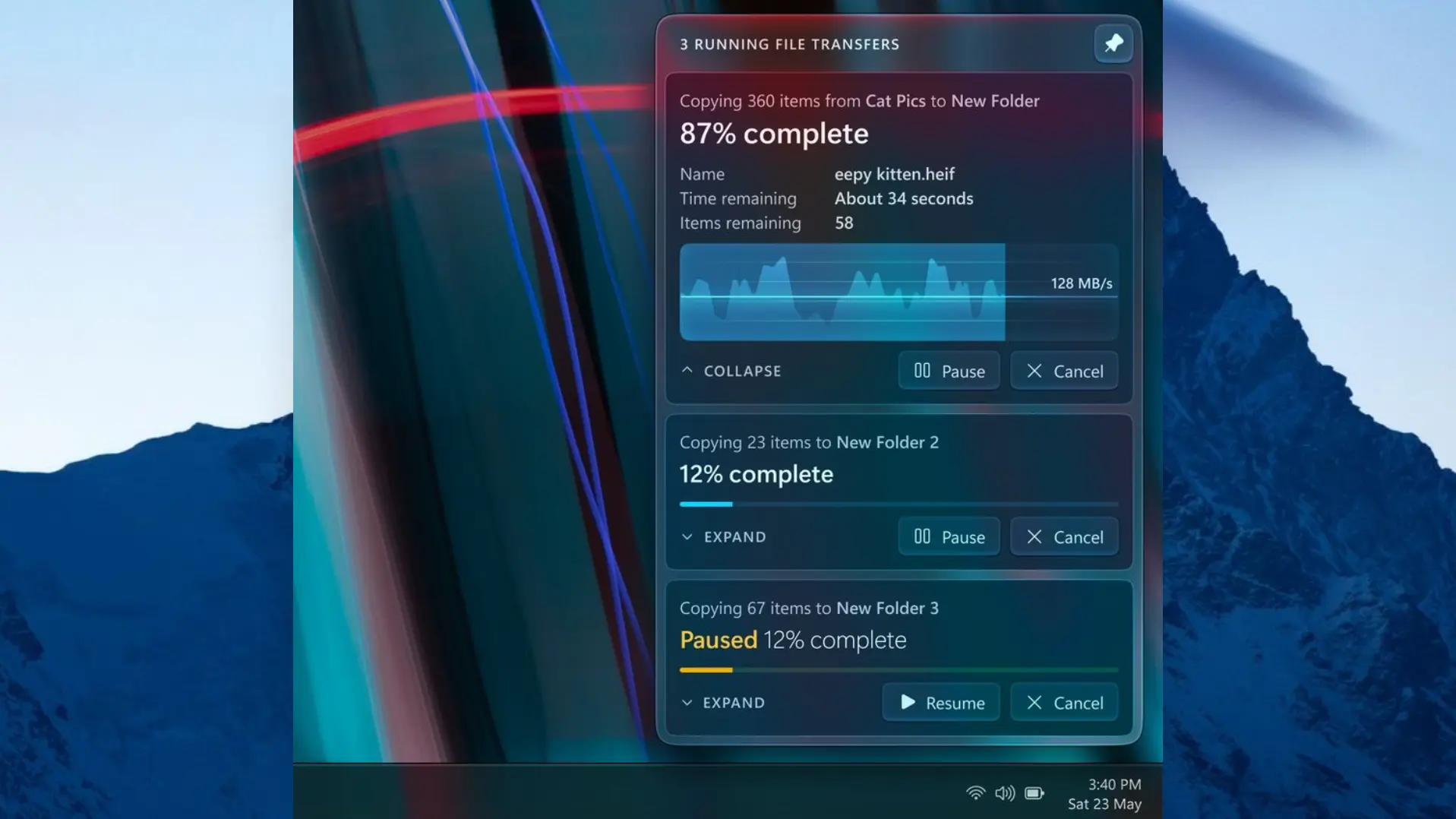
Meanwhile, the other idea is a relatively simple concept that allows users to pin the file transfers dialog to the top, so that it is always visible. This likely solves an annoyance related to this particular dialog box going to the background each time you change focus.
Of course, there are some more radical changes present in this concept too. File Explorer looks very different with lots of transparency effects, new icons, and groupings. However, the designer doesn't focus on them, and personally, we are not fans of the aesthetics either.
As always, just because a concept looks good on paper doesn't necessarily mean that it will be good in practice as well. While Ahmad's design certainly introduces features that many will love, perhaps there are performance- or UX-related reasons for why they have not been implemented by a multi-trillion dollar company like Microsoft. That said, if you like concepts like these, perhaps you would like to compare it against another one that envisions a File Explorer for Windows 12.


9 Comments
Load the comments and join the conversation!
Read the comments, ask the editors questions, show respect and join the conversation.