Say what you will about Microsoft’s ‘Metro’ design language – and goodness knows, some people have plenty to say about it – but whatever your opinion on its aesthetic, the company’s user experience is clearly here to stay. From some of its earliest roots in Media Center, through to implementations in Zune, Surface, Windows Phone, Xbox, and soon Windows 8, Microsoft has firmly established Metro as the guiding light for interface design across all of its products.
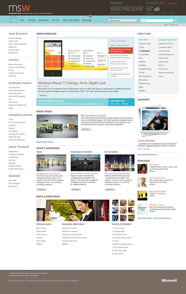
Metro has also found its way onto Microsoft’s web properties – take a look at microsoft.com as one obvious example. The company’s global corporate intranet, msweb, hasn’t escaped the Metro touch either. Having worked with MS on redesigning msweb, design agencies If/Then and Red October have provided a glimpse into its new Metro-focused look.
Overview
The project took a total of nineteen months from inception to completion. The content in these screenshots is obviously out of date, but the overall look and feel is the focus here.
People
Microsoft’s 90,000 employees around the world access msweb over 5.2m times every month. The new site design does a much better job of connecting people within the company; the ‘professional-social’ focus is evident, with profiles for employees, along with photos and a wall on which colleagues can leave messages.

Information
News about the company is also available on the intranet, where staff can share comments and thoughts on corporate developments. The comments here show MS staff getting excited about Microsoft’s new KIN phones. Oops.

Guidelines
To the uneducated eye, Metro is just a load of text and squares thrown together – but there are strict guidelines to maintain consistency of the user experience.

We’ve come a long way
The Metro-inspired redesign is certainly an improvement on earlier designs of msweb. The agencies behind the new design say that feedback on the new design from Microsoft employees ranges from “functional” and “inspiring”, to “beautiful” and “stunning”.

Seems like a job well done then.


36 Comments
Load the comments and join the conversation!
Read the comments, ask the editors questions, show respect and join the conversation.