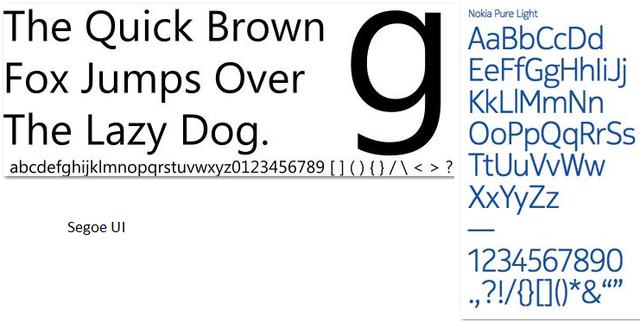
Nokia has been in the cell phone business for a long time. It is a very easily recognized brand, and that was one of the reasons Microsoft was so intent on working with them to grow their new mobile OS. One of the more recognizable aspects of the brands is its font choice. It’s a love it or hate it kind of situation, but it’s very much Nokia.
In an effort to further embrace their new big Redmondian brother, CEO Stephen Elop has decided to change the iconic font. The new typeface, called Nokia Pure, is a much more modern and streamlined font that bears a striking and unsurprising resemblance to another familiar font that Microsoft leverages for everything from marketing materials to OS fonts.
Microsoft and Nokia became partners in a win-win situation, whereby Nokia would save itself by migrating its smartphone platforms to Windows Phone 7, and Microsoft would gain an important hardware partner and user base. Elop described his company’s situation as “standing on a burning platform,” and re-imagining such an important aspect of Nokia’s brand image is a sure sign that its willing to jump head first off that platform and into the arms of Microsoft. According to the official release,
…the new font also helps us create a sense of harmony. Harmony between the various different parts of a large, global company.


23 Comments
Load the comments and join the conversation!
Read the comments, ask the editors questions, show respect and join the conversation.