I have been using Windows 11 since the day it launched in preview. I reviewed it for Neowin and have published a lot of articles detailing my thoughts on the OS. Although my original feelings remain the same in the sense that I still think that Windows 11 is a pretty but unnecessary update which sacrifices functionality in a lot of places, my viewpoints in this area constantly evolve, just like the OS itself.
Today, I'm writing about some of the smaller features or UX experiences that I dislike in Windows 11. Some of our ardent readers may recall that I detailed my thoughts on five things I hate about Windows 11 back in November 2021 but I have decided to revisit this area for two reasons.
The first is that it's been almost nine months since I published that article and obviously my thoughts can change on a topic. The second and more important reason is that the previous article was more about core or wide-ranging features that I have to use everyday in Windows and "hate" because I don't like their current implementation. This, on the other hand, is more of a "pet peeves" article. The items mentioned in this list don't make my usage of the OS unbearable, but they still cause minor annoyances either aesthetically or in minor usage.
Before you dive into the list, please note that my thoughts are based on my usage of various versions of Windows up until the latest Dev Channel build 25174. As such, some of the things I talk about may be generally available while others may only be in the Insider Preview for the time being. With that clarity, let's begin!
1 - Immovable Taskbar icons

Yes, the Taskbar is not the best piece of software implementation in Windows 11 but what really grinds my gears is the fact that some icons cannot be moved at all. The culprits for this offense are the Start menu (Windows logo), Windows Search, virtual desktops, Teams Chat, and Widgets.
Now, I get that some of these icons were also fixed in Windows 10 but I'm judging Windows 11 is on its own merit right now. I understand the need to fix some very OS-specific and core functionality like the Start menu on the Taskbar and maybe even Search, but the rest of the three applications I referred to should be treated exactly as such, applications.
It's odd to me that something as optional as virtual desktops, Teams Chat, and Widgets follows an "all or nothing" UX strategy. You can unpin them all from your Taskbar but if you do pin them, you can't change their location.
A centered Taskbar is my preferred UX and I occasionally use Widgets and virtual desktops (I have no love for Teams Chats), but I would personally like both to be moved to the right edge of my Taskbar because they are not something I use regularly. However, Microsoft does not provide this option at all.
Again, this doesn't break my workflows but is a pet peeve because I accidentally click on the left side of my Taskbar (force of habit from Windows 10) or Teams Chat because I keep my most used apps on the center and left side of the Taskbar, so it's a bit annoying to unintentionally open the wrong apps at times.
2 - Email ID in Settings

This is probably just a minor convenience but I dislike that my email ID is always displayed in the Windows Settings app. Because I write for Neowin, I have to take screenshots for a lot of apps in articles, and this includes the Windows Settings app, and then I have to hide my email ID manually each time.
Case in point in this article where I have to first take a screenshot and then use Snipping Tool to cover my email ID for privacy reasons. Again, this is not something that may impact everyone, maybe it's just people in my domain or those sharing their screen during a troubleshooting section.
It would be much more convenient if Microsoft just displayed a Microsoft Account logo of some sort and only if you hovered over it would your email ID be shown. Oh well.
3 - App folder management is bad

Microsoft introduced app folders in the Start menu in build 22557 back in February and while it has made minor improvements to the feature, I still thing there's a long way to go. Managing app folders is such a chore.
There is no way to add or remove multiple apps from folders. If you add a dozen apps in a single folder but then decide that you'd prefer to have six of them in one folder and six in the other, you would have to manually drag-and-drop six apps outside of the first folder, put them on the Start menu, and then drag-and-drop them into the second folder.
It just bewilders me that multi-select is not something that Microsoft has released to the public in the past six months. It's archaic to manually handle each app when you want to move it out of a folder. What exacerbates this problem even further that there is no quick mechanism to remove a folder, you would have to manually drag-and-drop each app outside of the folder before you can remove it.
It's clear that app folders in the Start menu have a long way to go in terms of UX.
4 - Microsoft 365 redirect in Windows Settings
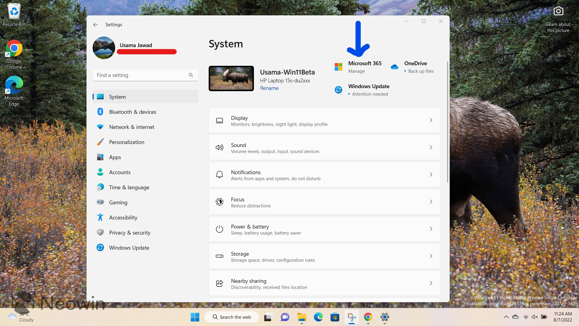
Now this is an odd duckling. The Settings app in Windows 11 has a dedicated Microsoft 365 management section of sorts, however, the main indicator on the home page of the app (screenshot above) opens the browser instead of going to that section.
I prefer to have a unified and streamlined experience when interacting with the OS and it's bizarre to me that by default, the Microsoft 365 button directs to a browser URL rather than the information housed inside the default app, which can be seen below:

I have been a Microsoft 365 Family subscriber for a few years and it's understandable to me if Microsoft cannot offer all the functionalities of the web portal inside the Settings app despite the integration. However, in my opinion, the Microsoft 365 button should redirect to the page above and should only be redirected to the web portal if they try to do something not offered by the app.
Right now, it's a bit of a jarring experience that is not really pleasant to use. At worst, it reeks of inconsistency and the lack of attention paid to the design of a feature that is actually very useful for subscribers.
5 - Microsoft still can't figure out context menus
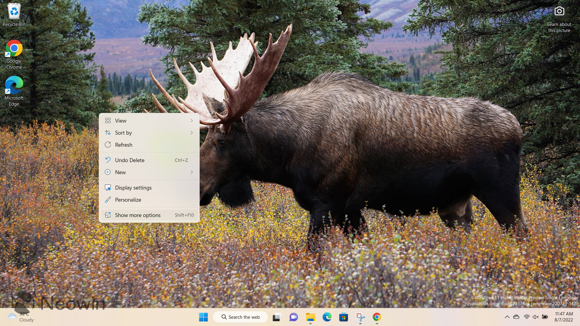
I've talked about the context menus before too but what I want to focus this time around is on Microsoft's apparent indecisiveness with the behavior of the capability. I think I've mentioned this in some other articles before but I don't hate the new context menus and this is because I see both sides of the argument.
I understand that the new context menu makes some changes to the appearance of certain functionalities (and perhaps, strips away some of them too) but I understand stand Microsoft's reasoning behind updating and simplifying its look too.
What's annoying to me is that Microsoft seems to be extremely unsure about how it wants to handle this change. In the past year or so, the context menu has remained mostly the same in Windows 11 where it presents the new UI by default but you can also click on the "Show more options" to revert to the Windows 10 menu.
It shows that Microsoft knew that it rolled out a half-baked implementation with Windows 11 and that's not a good look. At this point, unless Microsoft has some magical solution up its sleeve that it will roll out in the next couple of weeks and pacify everyone, I'd honestly be okay if Microsoft pulls the trigger on either of the two current UI options.
Again, I'll emphasize that this doesn't kill my daily workflow, this article was never about features of this sort, but it's just a minor annoyance in terms of the impression I get about an organization as big as Microsoft and one that collects so much feedback from users not being able to figure out which direction it wants to go in with certain Windows features.
Do you agree with this list? Are there any pet peeves or minor annoyances you have about Windows 11? Let us know in the comments section below!
Do not forget to check out my companion article about 5 smaller features that I like in Windows 11!


34 Comments
Load the comments and join the conversation!
Read the comments, ask the editors questions, show respect and join the conversation.