Despite announcing Windows 11 availibility on October 5, Microsoft has pulled the trigger on the staggered rollout as it becomes October 5 around the world, so the general rollout of Windows 11 is starting today October 4 in North America. The OS will be flighted in a staggered manner to eligible users automatically via Windows Update.If you are on a supported machine and are eager to the receive the update, you should head over to Windows Update and manually check to see if you can trigger the update. If it doesn't become available, it's likely that you are not included in the initial subset of users that the OS is being seeded to. Since the OS is being rolled out in a staggered manner, it means that you'll eventually get the update. However, if you simply can't wait, you might want to check out how to upgrade to Windows 11 right now.
Windows 11 was officially announced on June 24 and is the successor to Windows 10, which was formally unveiled in September 2014. It is available as a free and optional update for those on supported Windows 10. This time, Microsoft has been really strict with system requirements (you can check out more details here) and while unsupported machines can still upgrade to the OS, they will have to sign a waiver confirming that they will not be entitled to updates. If you're unsure about whether your PC is eligible for Windows 11, you should probably check out Microsoft's PC Health Check app, which can quickly tell you the status of your machine. It is important to remember that even if your PC doesn't qualify for the free upgrade, you're not being left out in the cold. Windows 10 is supported until October 2025, and you will receive version 21H2 of the OS soon as well. That said, if you were really looking forward to updating to Windows 11 but don't want to do so in an unsupported state, you'll likely be left with a bad taste in your mouth.
We have been discussing Windows 11 for quite some time now and taking a Closer Look at some of its standout features and enhancements. However, with the OS now generally available, we feel like it's time to compile our thoughts in a comprehensive manner and see how the individual pieces come together. Let's begin!
Start menu

The Start menu has received a major overhaul with this release of Windows. Gone are the Live Tiles that were a design staple since Windows 8, and in come pinned apps that will be more familiar to users of smartphone devices. I personally never used Live Tiles that much and will likely never utilize Pinned apps either. But people who leveraged the Start menu in Windows 10 quite a lot will be disappointed that Microsoft has taken away some useful features such the ability to group apps, which essentially means that you have a lot more scrolling to do if you want to find a specific app. I can't help but feel that this is a design oversight on Microsoft's part, especially considering there's no workaround.
While recommended files are displayed in the bottom half of the Start menu, Microsoft thankfully does allow you to disable this, which I think is great in terms of privacy. In today's hybrid world, if I'm sharing my entire screen, I don't want my files to be visible to the audience each time I click on the Start menu.
Meanwhile, the Search experience in Windows 11 is a bit of an odd duck. When I initially had a look at it a few months ago, I noted how the search bar in the Start menu is closely coupled with the dedicated Search button. In fact, it was so closely related that if you click the search bar at the top of the Start menu, it closes the Start menu and opens the dedicated Search UI, which is a very jarring experience. You would hope that Microsoft would have fixed this by the time of Windows 11's general availability, but unfortunately, this is not the case. While Search seems to offer relevant local results in my use-case, I find it simply ludicrous that Microsoft is shipping Start menu in its current stuttering state when it comes to integration with the Start menu. This is not a good look for the OS, especially considering that the Start menu is used by tons of people.

Taskbar
.jpg)
The Taskbar in Windows 11 is probably the most controversial feature of the OS. That is because Microsoft has taken a bunch of features away and practically added nothing back in the name of "simplification". If you used to right-click on the Taskbar and open the Task Manager from the corresponding context menu, too bad, you're out of luck. The Windows 11 Taskbar does not have a proper context menu.
Then there's the problem of its placement. The Taskbar is centered by default and while you can align the items on it to the left, you can't change the location of the taskbar. Although I always position my Taskbar at the bottom, I absolutely understand why some people are furious that Microsoft has taken away this capability.
And that's not even all the company has taken away. You can't even drag-and-drop apps on the Taskbar to pin them. You can't view the date and time on multiple monitors. The system clock does not show time to the accuracy of seconds anymore. You can't make items smaller. The list goes on and on.
The apparent reason for these drastic changes is that the Taskbar is actually something that was borrowed from the now-defunct Windows 10X, a simplified OS that was being designed for dual-screen devices. This simplification results in a modern aesthetic that is arguably nice to look at in Windows 11, but it fundamentally cripples the functionality of a UI element that is very important, especially for power users.

Widgets

Widgets are a mixed bag for me in Windows 11. Microsoft gave us a taste of widgets in the Taskbar with the "News and Interests" functionality at the start of the year. For some reason, it decided to do a u-turn on this stance in Windows 11 and you'll no longer find that information directly in the Taskbar. Instead, there is a dedicated button for Widgets in the Taskbar.
Clicking on it opens up a set of widgets where you will find information related to weather, stock prices, news, and more. It also integrates with Microsoft To Do, Outlook Calendar, and OneDrive albums so there is a lot of opportunity for personalization here. You can also further customize what categories of news you are interested in. Alternatively, if you're not interested in Widgets at all, you can simply remove the Widgets icon from the Taskbar via Windows Settings.
I don't have major complaints against the implementation of Widgets in Windows 11 and I do find myself using it sparingly. However, it takes up a lot of screen real estate. It occupies roughly 40% of the horizontal width on my 15.6-inch laptop display with a resolution of 1920x1080. Clicking on any other UI element closes the Widgets pane. This essentially means that there is no room for multitasking. Either you have Widgets open or you continue with other tasks, there is no way to have them both open side by side, where I can maybe scroll through the news on the side while browsing social media. I feel like Microsoft can further enhance the UI behavior to make it more useful for those who want to benefit from the capability.

File Explorer

The File Explorer in Windows 11 has received a redesign too. Notable changes include some fresh icons that I personally really like, and a ribbon UI that replaces the legacy toolbar interface provided by previous versions of File Explorer. I have no complaints against either of these things since I have been able to find what I want quite easily. Most of the settings in the toolbar have been moved to the three-dotted menu. However, the emphasis on ribbon icons instead of the usual text in toolbar makes the job of support desks relatively difficult, and it also means that people have to familiarize themselves with a new interface, especially if they don't use shortcuts.
There is a new context menu too, but this is more of an OS-wide change rather than something that is dedicated to File Explorer, so I'll discuss it more in the "UI" section of this review.
While I like the overall UI redesign, I have started noticing some performance issues when it comes to my day-to-day use of File Explorer in Windows 11. This is especially prominent when I'm choosing a download location for a File and the icons take a second to load. It's not a deal-breaker but it is definitely noticeable. I have no such issues in File Explorer on Windows 10. Other Neowin readers have noted the problem too, so the issue is definitely not isolated and will be noticed by other people who upgrade to Windows 11 too.

Multitasking

Multitasking is a very broad area when it comes to the OS level, so I'll only be focusing on major improvements in this area rather than each and every detail. Starting off with probably my most favorite Windows 11 feature, we have Snap Layouts and Snap Groups (collectively, Snap Assist). This is something that the OS has borrowed from PowerToys in Windows 10, and enables users to quickly snap windows to different areas on the screen. Screen locations are presented when you hover over the "window" icon of a window. Although the functionality has been available in previous versions of the OS using shortcuts too, this new interface really makes things a lot easier and brings other advantages in the form of Snap Groups too. These are essentially collections of apps in a Snap Layout that you can open or close with a single click. I find that Snap Layouts and Snap Groups have really increased my productivity thanks to their ease-of-use.
Similarly, Virtual Desktops have received some nifty improvements too. The most obvious one is a clean UI because Timeline has been axed. Other enhancements include the ability to set different backgrounds for Virtual Desktops, and the ability to efficiently move them using the context menu. This is not groundbreaking stuff, but all these small improvements make for a much more satisfying experience overall.
Meanwhile, the Quick settings are a bit of a mixed bag. Microsoft has done away with the Action Center and split quick settings and notifications into their own separate trays. This isn't a bad thing in my opinion as it means that less screen space is taken up. What really bothers me here is the odd coupling of the system icons on the Taskbar. If you click on any of these icons, you have to see all the Quick settings rather than the relevant ones. It isn't a deal-breaker but it's an odd design decision because it means that you might have to visually sift through all the settings before you find the relevant one, until you familiarize yourself with the new interface, at least. I really hope Microsoft changes this behavior in future iterations of the OS.
- Closer Look: Snap Layouts and Snap Groups in Windows 11
- Closer Look: Virtual Desktops in Windows 11
- Closer Look: Quick settings and notifications in Windows 11

User Interface

Although we have indirectly talked about UI a lot when discussing specific features above, I think it's worth discussing it separately too, particularly due to the fact that some UI changes are OS-wide. These are primarily rounded corners and updated context menus.
Rounded corners are a minor but noticeable change that you'll notice when you upgrade to Windows 11. Instead of having sharp corners across windows and context menus, you'll notice that a lot of OS component and apps have been updated to have rounded corners. In my opinion, they are pleasant to look at and do not detract from the core experience of using Windows. Some may not like them but I think everyone will get used to them eventually, which isn't a bad thing.
Context menus is yet another element which has received a major revamp. Context menus now support a ribbon at the top for common functionalities, similar to File Explorer, while other options are neatly grouped below them. However, one thing of note is that some options that contain third-party apps integrating directly with certain file types will not be immediately visible. They are tucked away in the "More options" configuration which will open the legacy context menu. Simply stated, this not the final behavior. Microsoft hopes that developers update their integration mechanism to be shown in Windows 11's updated context menu, but until they do that, they will have to reside in the legacy context menu which is not immediately visible. While I agree with the overall approach, the potential drawback is that many developers may simply refuse to update their apps or may have already abandoned them, so there's absolutely no guarantee that you will see all third-party integrations in the Windows 11 context menu ever.
There are other smaller UI improvements too. This includes updated icons and design language across the OS as well as certain Microsoft apps like Clock, Photos, Snipping Tool, and Paint. But this is more of a work in progress and we'll likely see more improvements being made in this area with the passage of time. The modern UI seems to a strong focus in Windows 11, but more work needs to be done to make it consistent across the entire OS.
- Closer Look: Context menus in Windows 11
- Closer Look: Power and battery settings in Windows 11
- Closer Look: Clock app in Windows 11

Microsoft Teams Integration
Ah, probably one of the most unnecessary features in Windows 11, in my opinion. Microsoft is positioning Teams as a brand for consumers and is integrating it directly into its new OS. It can be accessed directly from the Chat icon in the Taskbar. The idea is to make Teams the FaceTime of Windows 11, something that the company has failed miserably at with Skype.
Right now, Teams integrations offers a flyout UI directly above the taskbar when you launch it, and from there, you can communicate online with your friends and family. While there isn't anything inherently wrong with this approach, the issue is that there is no strong selling point for the feature. Most people have better alternatives at hand for online communication and the only possible selling point I see for this over other alternatives for personal online communication apps such as WhatsApp is the ability to quickly share your PC screen. In the 25 years that I have spent on this Earth, I have personally never come across this use-case.
Then there are other issues with this Teams integration too. Chat windows do not support Snap Layouts - even though it's an OS-level functionality -, the context menus are barebones, the UI is unintuitive, and frankly, quite buggy.
Simply stated, Microsoft really wants to utilize Teams for personal communication, likely banking on its success in the enterprise space, but right now, there just isn't a strong enough selling point for people to move en masse to Teams for online communication.

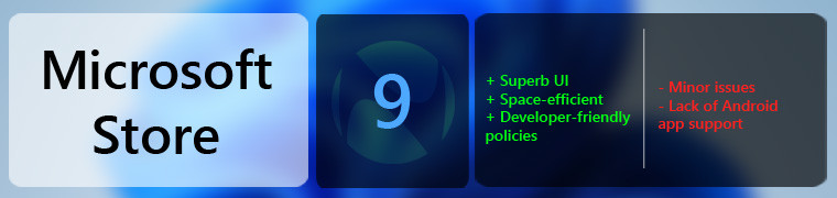
Microsoft Store
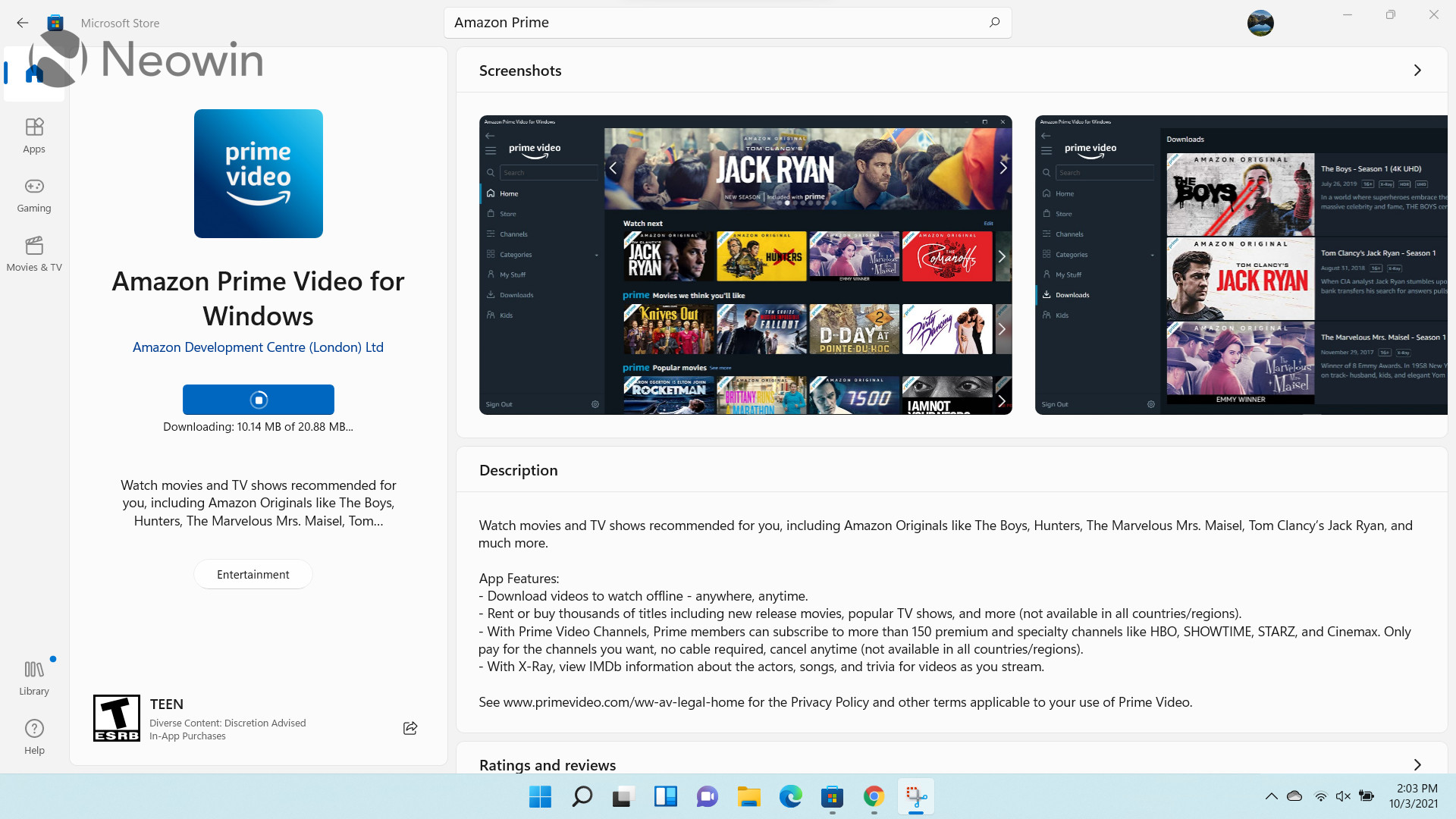
The Microsoft Store redesign in Windows 11 is coming to Windows 10 too, but since this is something that Microsoft worked on with Windows 11 in mind, it makes sense to discuss it in the OS' overall review as well.
The digital store has been overhauled pretty much end-to-end in an effort helmed by Rudy Huyn, a stellar developer who worked on third-party clients for Windows Phone when prominent developers such as those behind Instagram and Snapchat refused to support the platform.
The app has been seemingly built from the ground-up with a brand new experience across every page that you visit including search, individual listings, library, settings, and more. There are some nifty effects and animations too when you interact with certain UI elements, space utilization is much better, and I have genuinely enjoyed my time with the app. Make no mistake, it's not perfect, but I feel like Microsoft is on the right track here in terms of design and I can see things only improving from here.
Microsoft has made the pot even sweeter for developers by opening the Microsoft Store to competing browsers and other storefronts like the Epic Games Store. It accepts all applications too, regardless of the framework or technology used to develop them. This essentially means that developers can publish Win32, .NET, UWP, Xamarin, Electron, React Native, Java, and Progressive Web Apps directly to the storefront, and will be responsible for its update mechanism. Coupled with developer-friendly policies related to revenue-sharing, I think the Microsoft Store can become a major player in the app distribution front.
The only major issue worth highlighting is the lack of Android app support, which isn't really a flaw of the Microsoft Store, but is closely related. Microsoft touted it heavily when it announced Windows 11, but since then, we have learned that the feature - made possible due to a partnership with Amazon - is not coming on October 5 after all, which is a major bummer. Unfortunately, there is no firm release date for the capability and it's not even available in the Windows Insider Preview channels, so it could be days, weeks, months, or years away from general availability, who knows. But overall, it's not a good look, especially considering the hype surrounding it.
Default apps settings

While I didn't plan to write about this initially due to the fact that it's not really a feature, I was skimming through my Closer Look articles, and realized that people simply have to know about this especially because of the potential headache that it is going to cause them and because it's straight up anti-competitive.
Windows 10 offered a way to quickly set the default app for particular categories such as Email, Maps, Music player, Photo viewer, Video player, and Web browser. This is completely gone in Windows 11. Now, Microsoft wants you to manually set the default app for each extension protocol. If you want to change your default browser from Microsoft Edge to Google Chrome, you'll have to painstakingly set it as such for each file type and extension.
Apart from being a headache for consumers, it's also blatantly anti-competitive. There's no other way to say it. The move has faced massive backlash from competitors and Mozilla has even reverse-engineered Microsoft's code to quickly change the default browser to Firefox for all relevant extension types. It's just unacceptable and developers are already building tools that forces Windows to bypass default apps, just because the OS does not really respect user preferences in a lot of cases.
People who upgrade to Windows 11 and utilize a lot of third-party apps for certain file types need to be aware of this caveat, especially since it affects the end-user experience in a notable way.

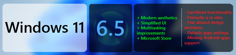
Conclusion

Before I properly kick off the final section of my review of Windows 11, I would like to highlight that my final score (verdict badge at the end) is not the average of the aforementioned features. If that was the case, my final rating would be 6.05/10, which it is not. That is because I believe that an OS is more than the sum (or in this case, the average) of its individual parts. It's more about how all those different pieces come together to provide an overall experience.
Simply stated, I really, really wanted to like Windows 11. You can gather from everything I've said above as well as my dedicated Closer Look articles, that I love the modern UI design as well as specific features like Snap Assist, the Microsoft Store, and other multitasking enhancements.
However, there are some things that I just can't ignore. Glaring examples of this is the half-baked and shoehorned implementation of Microsoft Teams, the awful Taskbar, and the default apps settings.
I fully understand that a lot of these things will improve with time, but I just can't help but feel that Microsoft rushed to meet some deadline that we don't know about yet. You can't just make a big deal out of Android app support when you unveil the OS on June 24 and then randomly decide that you're not going to make it available with general release on October 5.
Then there's the problem of missing functionality too. Microsoft, you shouldn't need Windows Insiders to tell you that they don't want to sacrifice functionality for the sake of simplicity. And even if that was the case and the company absolutely needed your input on each and every feature, it's not like the Feedback Hub already doesn't have hundreds of highly-upvoted bug reports and feature requests. It's just absurd that we are getting a "simplified" taskbar that barely functions and a Start menu whose search functionality stutters majorly. Microsoft may treat Windows Insiders like glorified software testers, but they shouldn't be shown disrespect in the form of ignored feedback for even the most basic of functionalities. Given the misses in this OS and half-baked implementation of a bunch of features, one has to wonder whether Insider feedback is even taken into account at all.
Don't get me wrong, there is stuff to like here. As I've stated multiple times, I really like the modern UI, aesthetics, icons. I don't even have a problem with the bottom-centered taskbar or the divisive Start menu, but people really need to be given more options when they're using something as big as an OS. You can't just remove functionalities left and right in the name of simplification and expect everyone to sit quietly.
All in all, the problem with Windows 11 right now is that with the absence of a standout feature like Android apps support, it just feels like a re-skin of Windows 10 and nothing more. The re-skin is nice but is it something that you should upgrade to as soon as possible? Not at all. Windows 11 has a bunch of right ideas but it needed more time in the oven, I don't understand why Microsoft decided to rush an OS update which doesn't even have all of its marketed features yet. And even the included features lack lots of functionality.
Unfortunately, Windows 11 is just another entry in Microsoft's book of "ship first, fix later". It's not bad, but it's not great right now either. There's tons of potential here; simplification of UI isn't a terrible idea but having it there in a half-baked manner doesn't really make for an enticing user experience. Windows 11 will undoubtedly get better with time, but did we really need an OS update before the basic functionalities were complete? I don't think so. Right now, Windows 11 is little more than a glorified re-skin. There's more form here than substance. That isn't to say that the OS will never be truly great, it just wasn't ready for primetime yet, in this reviewer's opinion.
Have you used Windows 11 yet? If you have, what do you think about it? If you haven't what's holding you back and when do you plan to upgrade?


_small.jpg)


78 Comments
Load the comments and join the conversation!
Read the comments, ask the editors questions, show respect and join the conversation.