Windows 11 has been a bit of a mixed bag since launch. While very few deny its design aesthetics and the forward strides that Microsoft has made in certain areas, there have also been certain places where the company has massively regressed in terms of functionality.
That said, Windows 11 does have its charms, some of which I have talked about before. However, today, I'm revisiting this space because the last piece I wrote on this topic was back in November 2021, which not only means that the OS has evolved since then, but also that my thoughts on certain aspects of Windows 11 have changed.
Before you dive into the list of five smaller things that I like about Windows 11, please note that my thoughts are based on my usage of various versions of Windows up until the latest Dev Channel build 25174. As such, some of the things I talk about may be generally available while others may only be in the Insider Preview for the time being. With that clarity, let's begin!
1 - Volume flyout
This is something that Microsoft unveiled back in January and while I lamented the fact that the firm took so, so long to change the volume flyout in Windows, I should also emphasize that it is very welcome change.
Windows 10 had a very archaic volume flyout that was very noticeable, especially when you were playing media content. It showed up at the top-left side of the screen and even showed a bigger window about the media content that was being played. This meant that it took up a large portion of the screen, took some time to go away, and was very distracting.
On the other hand, Windows 11's volume slider has none of these problems. It sits innocently at the bottom of the screen and does not take up large amounts of space, even when you're playing media content. It's sleek and minimalistic, and makes my experience of using Windows 11 so much better.
2 - The design of the Settings app
The Settings app in Windows 11 is not perfect, but it's just so much better at categorizing options and making it accessible. The always-visible category pane at the left of the Settings app makes it easier to navigate and find content at a glance.
The category icons are arranged vertically which means that they "flow" well. Windows 10 had rows of icons on the main page so you had to search for icons both horizontally and vertically. Windows 11 solves this problem with aplomb.
Then there is the breadcrumbs navigation too. You can go deep into nested menus and still be able to trace your steps back, something which was completely absent in Windows 10. And if you want to go to a different category of options altogether, you can use the previously mentioned navigation pane on the left at any time since it's always visible. It's just so much convenient compared to what we had in Windows 10.
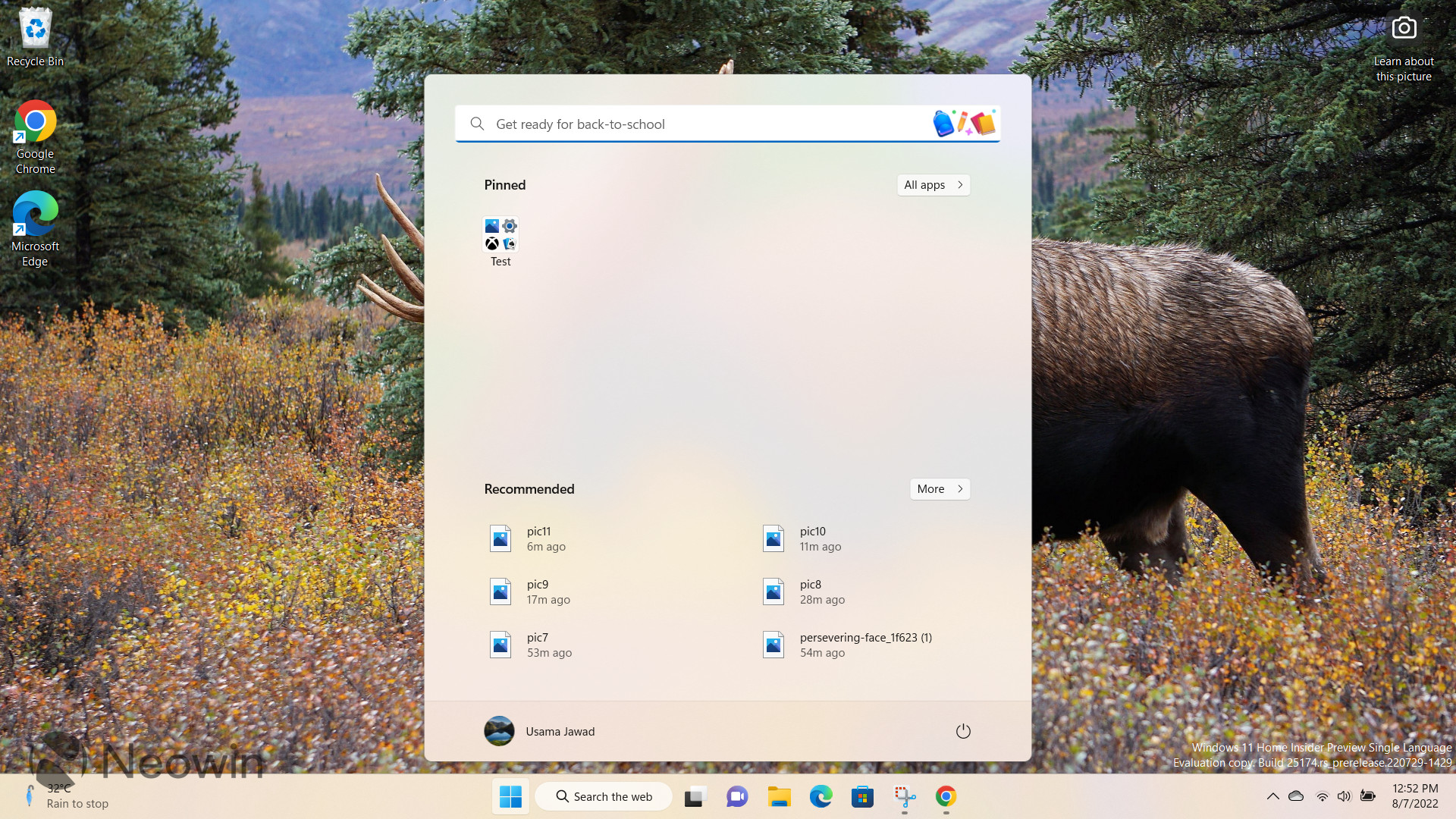
3 - Recommended section in Start menu

I'll admit, I wasn't a fan of the "Recommended" section in the Start menu because I thought that it took up a lot of space and I would barely ever use it. However, over time, my opinion on this has taken a u-turn.
Windows 11 has changed the way I interact with my files. The Recommended section shows me a list of my recently used, downloaded, and recommended files including content from Microsoft 365 cloud storage locations.
Since I use Microsoft 365, OneDrive, and Office online heavily, having almost immediate access to the content hosted on these platforms is just perfect for my use-cases. Editing files on Office online on a different PC signed in to the same account and then having near-immediate access to the same file without opening Office Online or downloading and transferring the file manually just feels magical.
I'm pretty sure I'm in the minority when it comes to the utility of the Recommended section based on the criticism I have seen across various platforms, but it really does improve my productivity and workflows a lot.
4 - Updated icons
This again boils down to the aesthetics of Windows 11 that I really like. Microsoft has updated its icons across the OS, including the File Explorer, Settings, context menu, Taskbar, and more.
Personally, I find them to be a lot more clearer and pleasing to the eyes. The color choices are appealing and while they don't necessarily factor into my workflow, they are eye-candy to me nonetheless.
That said, I'm pretty sure that some depths of the operating system probably still host a few old and outdated icons but I can't dock off points for something I rarely use or see.
5 - Start menu search transition
This is an interesting one. When Windows 11 came out, if you used the search functionality in the search bar of the Start menu, there would be a very obvious jitter as the Start menu closed and Windows Search opened instead. It was very jarring to me and gave the OS a very disconnected and unpolished feel.
Microsoft has significantly improved in this area in the Windows Insider Preview releases, at least. There's a new Search Widget so if you do click on the search bar in the Start menu, it still opens that Widget but it does so without the jitter and with some animation transitions that make the process seem seamless as well.
This is what the Start menu and the Search widget look like before you click on the search bar in the Start menu:
And here is what it looks like after you click on the search bar in the Start menu:

I'll be clear, there's still a light stutter, it's not completely seamless but it's way, way better than what we had at launch. In Windows 11's release version, it felt like two completely separate pieces of the OS had been cobbled together without any thought given to the UX. Now, it feels much more performant and the transition design animation where the Search Widget turns blue is quite nifty. There's still a ways to go, but we're getting there.
Do you agree with this list? Are there any features (small or big) that you like in Windows 11? Let us know in the comments section below!


11 Comments
Load the comments and join the conversation!
Read the comments, ask the editors questions, show respect and join the conversation.