With the release of Windows 8 nearly a decade ago, Microsoft introduced a new flyout for volume controls. And while you would expect that the UI would be updated with subsequent releases of Windows in order to align it with the changing design of the OS, this was inexplicably not the case. In fact, even Windows 11 shipped with the same decade-old interface for volume controls. Although the latest Dev Channel build 22533 finally updates this UI to align with the rest of the OS, I do have a bone to pick with Microsoft, especially since the change isn't available for general release yet.
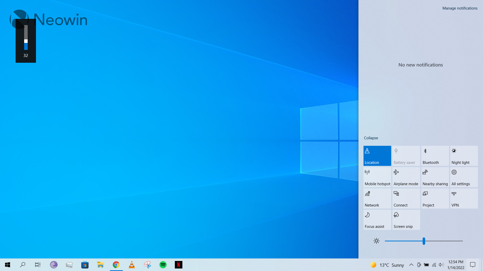
Let's start off by talking about the existing UI available in general releases. A screenshot of it can be seen above in my updated Windows 10 build. You can clearly see how disparate the volume flyout in the top left looks when compared to the brightness slider in the bottom right. It's like they're from completely different versions of Windows, which they are, to be fair.
Now, for a moment, let's put aside the fact that the volume overlay is obtrusive - and something that people have been complaining about for years - and just talk about how something as obvious as this is making its way to production software.
While I have been involved in software development professionally and academically for the past nine years, I wouldn't presume to know about the intricacies or complexities of Windows development at all. And that's okay, my complaint is mainly that this is purely a cosmetic change, surely it didn't need a decade of man-hours for Microsoft to finally update a small portion of its UI to make it consistent with the rest of its OS? Yet here we stand.
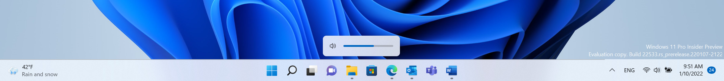
I want to emphasize that the new volume flyout is functionally the same as the existing one, a screenshot from the latest Dev Channel build channel build can be seen above. That said, according to some of our forum threads, it may need further work.
Given that the new UI is finally out for Insiders and is apparently consistent with the rest of the OS, you could write this piece off as a rant from an irate Windows user. But do ponder over what reasoning, or lack thereof, came into play when making decisions that involved revamping the entire look of Windows 10 and Windows 11, but then leaving the volume flyout as-is, for some reason. Some may even say that it's a minor thing that can easily be ignored, I would argue that it indicates a deeper problem in the Windows development process where blatantly inconsistent and everyday use interfaces are ignored.
At best, it represents Microsoft prioritizing more important things in Windows development, and at worst, it represents a total lack of attention to detail or the importance of a consistent UI that is being utilized by millions of users.
The general releases of both the operating systems still contains a legacy interface for volume flyout and maybe one day, Microsoft will publish a blog post explaining its reasoning. But until then, I will continue to wonder why such a minor but blatant cosmetic change took over a decade to implement.
What are your thoughts on the apparent snail-paced development and implementation of an updated volume flyout that is consistent with the rest of OS? Why do you think it took so long? Let us know in the comments section below!


_small.jpg)


38 Comments - Add comment