
I got my first PC in late 1995 from the late and great Gateway computers. Unlike most older PC users at the time, I rarely had to go to the command line route to run programs, with the exception of the occasional MS-DOS game like Descent. I just used Windows 95 and, more specifically, its Start menu, to launch programs and games.

The Start menu was Windows 95's calling card, and it helped Microsoft solidify its dominance in the PC operating system market. The idea of having a place where you could click on one button at the bottom left of the screen, and then access nearly any Windows program by expanding on the nesting columns from the left to the right was a huge time saver. On top of that, it also made Windows 95 look much different compared to, say, Apple's Mac OS

Windows XP made a big update to the Start menu in 2001. Instead of one column when you hit the Start button, there were two. The left hand side had all of your programs, with the most used ones getting the prime menu space, while the right side had links to your PCs more important folders. It was definitely a nice evolution from the original, which on occasion could flood the desktop with menus.

Windows Vista, as badly as that operating system was received, did include some small but important adjustments to the Start menu in 2007 that carried over to Windows 7's version in 2009. That included putting in a search bar on the bottom of the left Start column to find files and programs, which I found particularly handy for finding things like downloaded PDF files and images. You also got a sliding menu for the left column that replaced the right column when you clicked on some programs. The right column also listed categories in your PC instead of direct folders.
While there were major changes in the design of the Start menu since it was introduced in Windows 95, it seemed like this was a desktop feature that was going to be refined well into the future.
And then came Windows 8.
Oh boy.
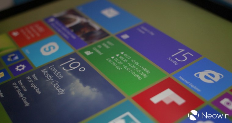
Microsoft felt that every computing device was moving into a touchscreen interface, so the company decided to develop a Start Screen. The colorful "Live Tiles" were meant to be used on touch displays such as laptops and tablets, but Microsoft seemed to forget that there were hundreds of millions of PCs out there with no touchscreens, especially ones that were desktops that used a mouse and keyboard. They still needed a UI they could use, but Microsoft didn't want to give it to them in Windows 8 when it launched in 2012.

In short, people hated Windows 8 in general, and its lack of a Start menu in particular. They hated it so much that they helped to launch a cottage software industry. Lots of small and big software developers rushed to create programs that added a version of the Start menu to Windows 8. Some of those programs continue even today, with StartAllBack (launched as StartIsBack) and Stardock's Start8, which has now evolved into Start11. Indeed, Stardock's CEO Brad Wardell told AllThingsD in May 2013 that Start8 had five million downloads since it launched in late 2012.
Those kinds of numbers from third-party apps showed that there was still a need for the Start menu in Windows. Just a few weeks after Stardock's Wardell revealed that five million download number for Start8, Microsoft confirmed that some version of the Start button would be back for Windows 8.1. Not the menu, but the Start button for the desktop.

It wasn't really what people wanted, but it was, pun intended, a start. In 2014, two years after Windows 8, Microsoft finally said it would return a version of the Start menu for a Windows 8.1 update. When Microsoft first showed the Start menu back at its annual Build developer conference in a keynote speech in April 2014, a massive cheer and applause came from the crowd.
However, at it turned out, Microsoft decided to wait until the launch of Windows 10, with a technical preview version in late 2014, to fully launch a new version of its Start menu, two years after the debut of Windows 8.

However, the Windows 10 Start menu was similar to what was shown back at Build 2014. The left column was for desktop apps, along with the PC categories on top, while the touchscreen Windows tiles from 8 and 8.1 were on the right hand column. Those tiles could be resized in the menu, like they could on the Windows 8 Start screen.

In 2021, Microsoft launched Windows 11 and with that came yet another makeover of the Start menu. For the first time, the menu didn't appear on the left-hand side by default but was placed in the center of the desktop screen. Thankfully, you can make some quick changes in settings to place it on the left-hand side. You also got a search bar on top of the menu, and thankfully there's no Windows 8 "Live Tiles" anymore. Instead, you can pin your desktop apps right on the menu.
While the Start menu in Windows 11 has some good features, it has nevertheless become a source of controversy for many people who feel that it doesn't meet the needs compared to the ones in older versions of Windows. The good news is that Microsoft isn't as tone deaf to feedback like it was in the Windows 8 days, so we should hopefully get more tweaks that will make the Start menu a major feature of future Windows versions for years to come.
Disclaimer: Neowin's relationship to Stardock


35 Comments
Load the comments and join the conversation!
Read the comments, ask the editors questions, show respect and join the conversation.