Though the curved body and overall hardware design receive most attention when discussing the Microsoft Band 2, it’s actually the new interface I’m most impressed with.
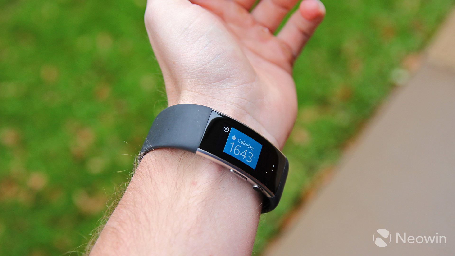
While the general layout of the interface is almost entirely unchanged – pretty much every element is in the same place it was before – there’s a lot of subtle improvements with how it works. Take your statistics found in the main tile, for instance. The original Band showed an extremely small progress bars at the bottom of the step and calorie screens to denote daily progress. With the Band 2, each now displays a prominent progress bar that takes up almost all of the screen while a text overlay shows the exact estimated steps taken or calories burned.
The progress bars and accompanying text animate as they appear on the screen, quickly growing to show your current step and caloric counts. Luckily, what could be a slight annoyance with a long animation isn’t, as each only takes about half a second to display its data.
The Band 2's improved interface makes the entire device easier to use
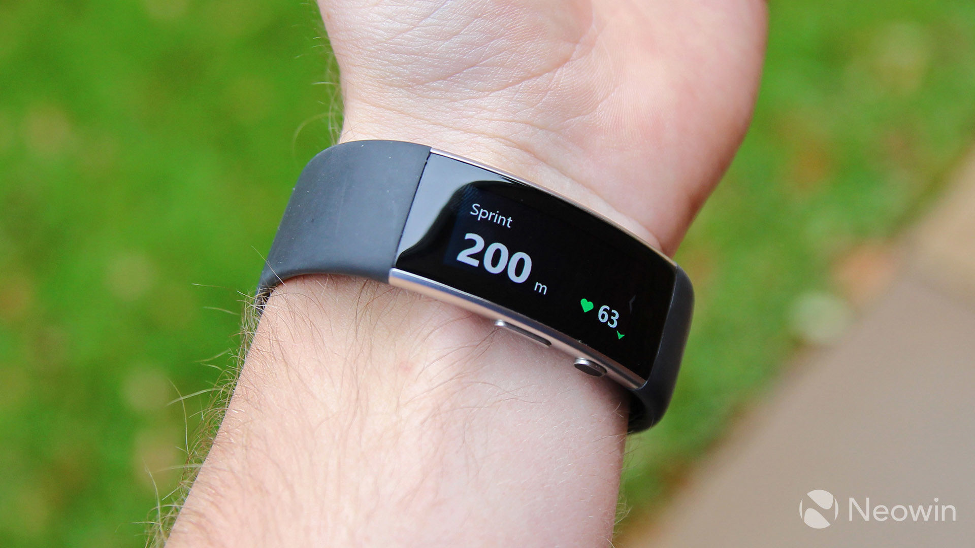
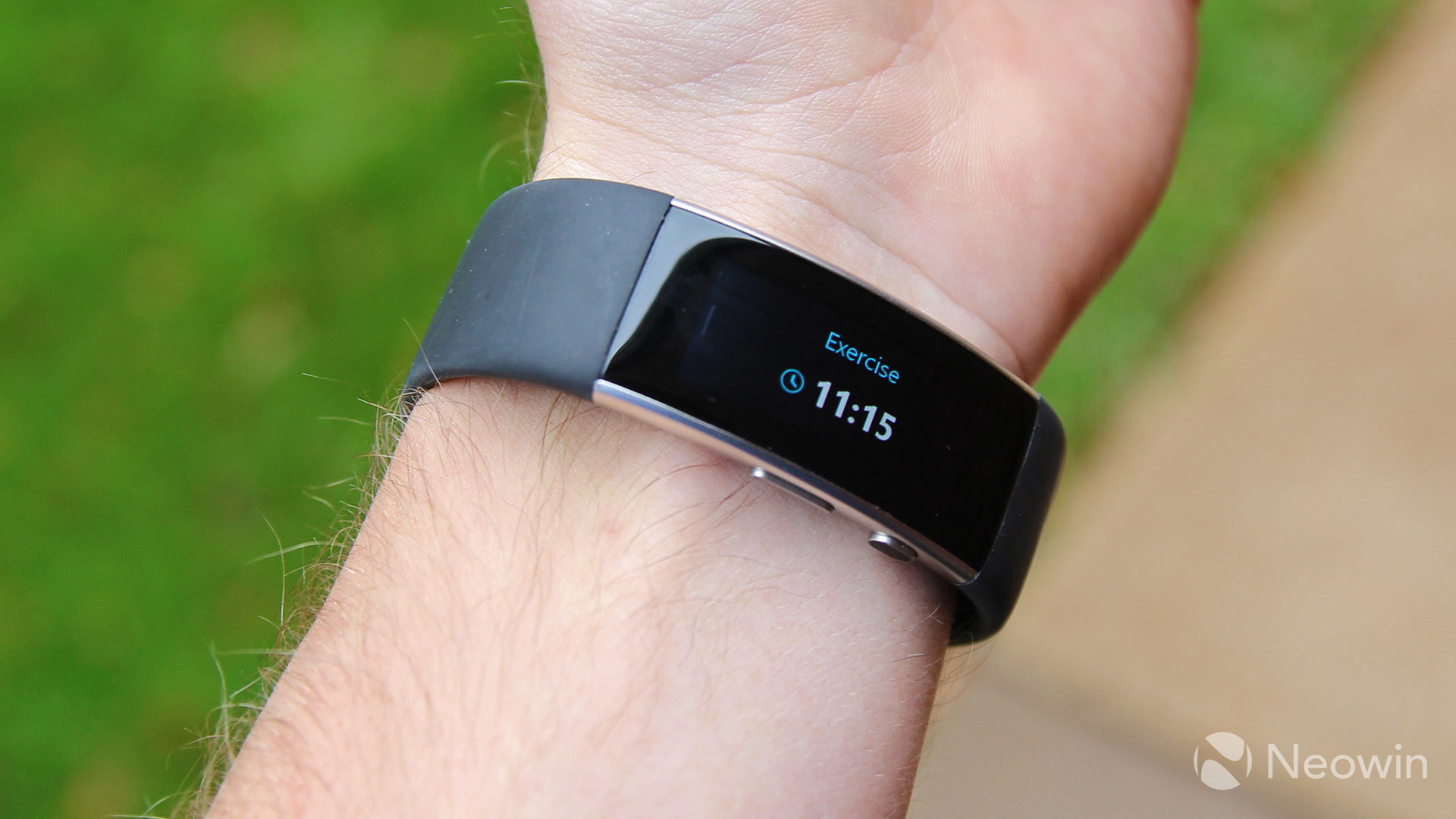
Another improvement is the placement of additional information. While the original Band had a tab you had to pull down from the top of the screen to see more data, the Band 2 moves this additional screen to the right side. Instead of pulling down, you pull from the right to the left, which makes more sense as the display has more horizontal room, so it’s not as difficult to get the information to show. Microsoft has also added a new screen to the general workout workout mode, allowing you to pull the horizontal tab to see a digital clock. With the original Band, you’d have to pause the workout mode to go to the home screen and see the time.
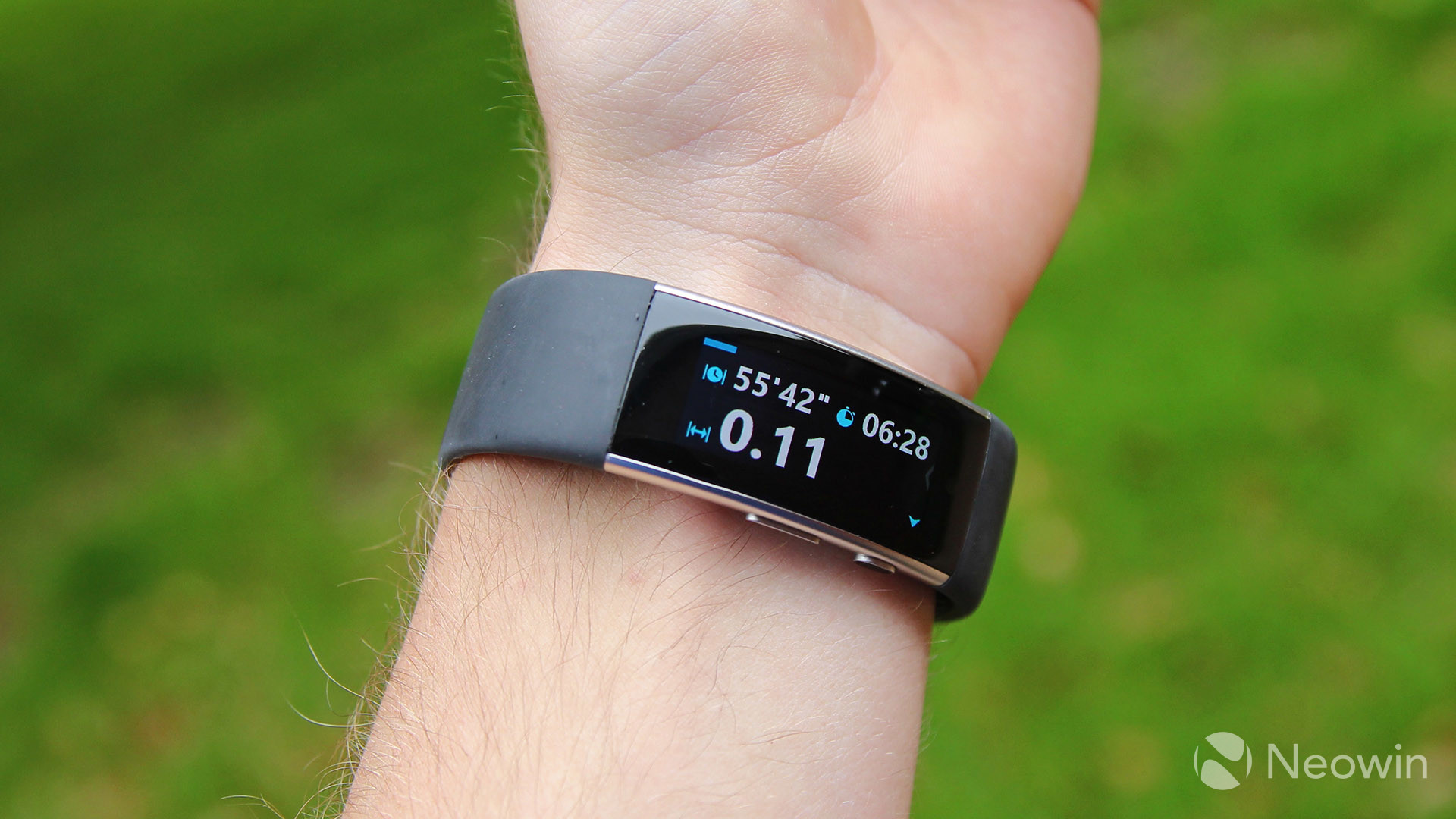
Microsoft has improved the running mode by adding a progress bar at the top of the screen, showing how far you are into each mile. This is a neat addition, especially if the total distance isn’t one of your data points on the primary display. Placing the bar at the top of the screen makes it stand out a bit more than the original Band’s daily step and caloric stats, since having data below it draws more attention to the bar because it’s a starting point. There wouldn’t be a big incentive to looking at it if it were placed at the bottom, because your eyes would have likely already scanned the text above it for the data you want.

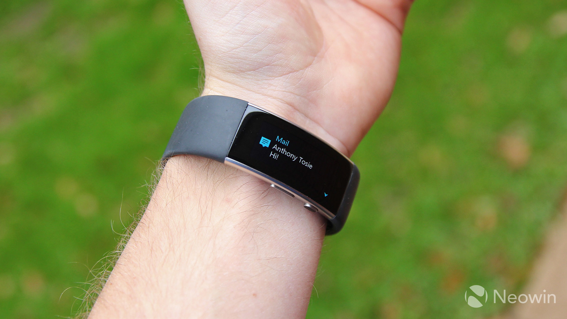
The improved display greatly helps with notifications, which are much more prominent than they were in the original device. Icons and text are much more visible, with vibrant colors that make them more readable on a quick glance.
Even the ability to see more information is better presented with the second-generation Band. When more information is available in a tile – or if a tab exists for additional data – the interface shows a peek of it at the far right. If you’re in the home tile, that means the icon and text from the next portion of the screen will show slightly to indicate there’s more if you scroll to the right.
Information is now hinted at with peeks to show other areas
All interface elements are much more prominent in the Microsoft Band 2, in fact. Buttons now take up the entire screen, whereas the original featured small buttons – and thus small hit boxes. The interface is much more in line with Windows 10, as the tiles, icons and other elements mesh better with Microsoft’s new operating system. Toggle switches now use the same pillbox style as Windows 10, for example.
If you’re into guided or custom workouts, the interface is also improved there. Instead of matching your theme color, workouts in this mode will display red elements you’re warming up, green elements when you’re doing an exercise and blue elements when you’re cooling down, matching the colors in the Microsoft Health online dashboard for creating a custom workout. It’s a subtle but good way of denoting the different portions of a workout.
Microsoft really nailed the interface this time around, as it’s now joy to look at while providing the same quality content. Improved responsiveness makes the display feel akin to a smartphone touchscreen, but the interface isn’t overwhelmed with content as some modern wrist-worn smart devices are. The Band 2 provides the information you need displayed in a way that’s easy to quickly glance, but its interface is attractive enough that it feels like a significant improvement over the original.
Gallery: Microsoft Band 2 Interface Design


16 Comments - Add comment