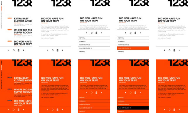
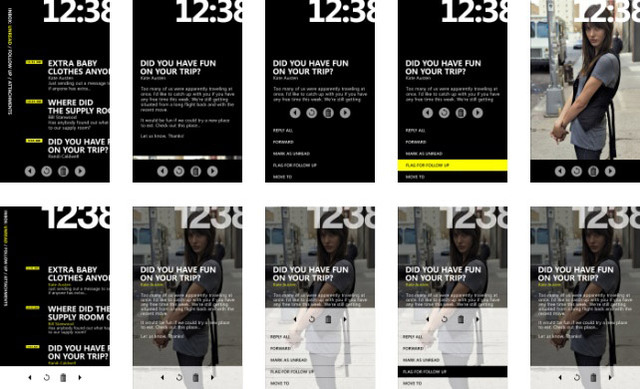
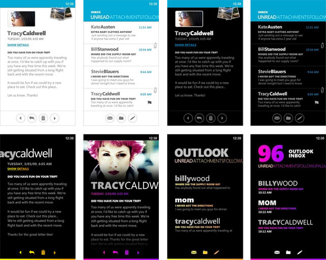
Long Zheng over at istartedsomething.com has posted some early concept shots of the Metro UI which eventually transformed into what we now know as Windows Phone 7 Series. The images were taken from slides used at a MIX 2010 session and showcases the evolution that eventually became what Microsoft has been showing off for the past few days. These are better quality versions of the images from Neowin's coverage of the Windows Phone UI and Design Language session.
In general, the overall layout of the concept shots appear similar to the design Microsoft has settled on. The biggest difference seems to be the fonts, which from what we've been told, will probably not be customizable in the final release. However, this remains to be confirmed.
There are a lot of interesting things that can be seen in the gallery below. Some show incoming calls popping up mid-screen in a very obtrusive way, and some show notifications at the top (which is what Microsoft seems to have planned). It's always nice to see the underlying evolution of a product. Metro UI is shaping up to be a very well polished piece of eye candy.
Gallery: Metro UI Concept Shots


24 Comments - Add comment