These days, it seems like everyone's making their own smartwatch, fitness band or some other variation of wrist-bound wearable. Before Microsoft acquired its devices and services business last year, Nokia was working on its own smartwatch too, which was being developed under the internal codename 'Moonraker'.
Images of the device were spotted on Tumblr by Evan Blass (aka @evleaks), having been posted there by Microsoft's Pei-Chi Hsieh (the images have now been removed). According to The Verge, these images were renderings created for marketing purposes, rather than just concept visualizations.
Indeed, it seems that the device came very close to actually launching - Nokia is said to have shown working prototypes to a select group of people behind closed doors at Mobile World Congress 2014, with a launch tentatively planned to coincide with that of the Lumia 930 - which was also around the time that the Moonraker codename first popped up.
Ultimately, the watch became a victim of consolidation efforts as Microsoft scrutinized its Nokia acquisition to identify potential overlaps with its own products. Microsoft decided that its own Band wearable device was a better proposition overall, and Moonraker was shelved indefinitely.
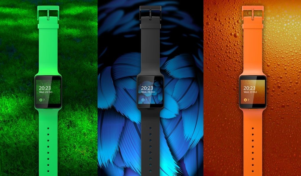
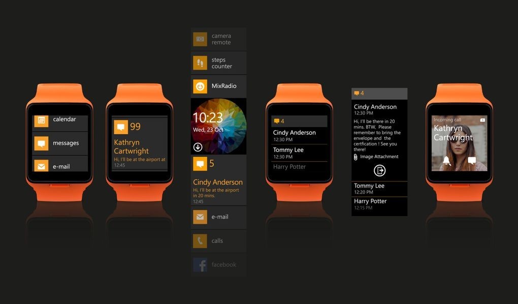
Even so, the Nokia device is said to have included some rather nice features, such as sensors that would enable the display to read an incoming text by holding your arm up closer to your face, and switching off the display again by lowering your arm. It also included Facebook and MixRadio integration, and a remote camera control feature for your phone.
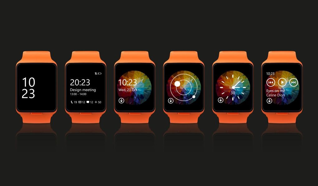
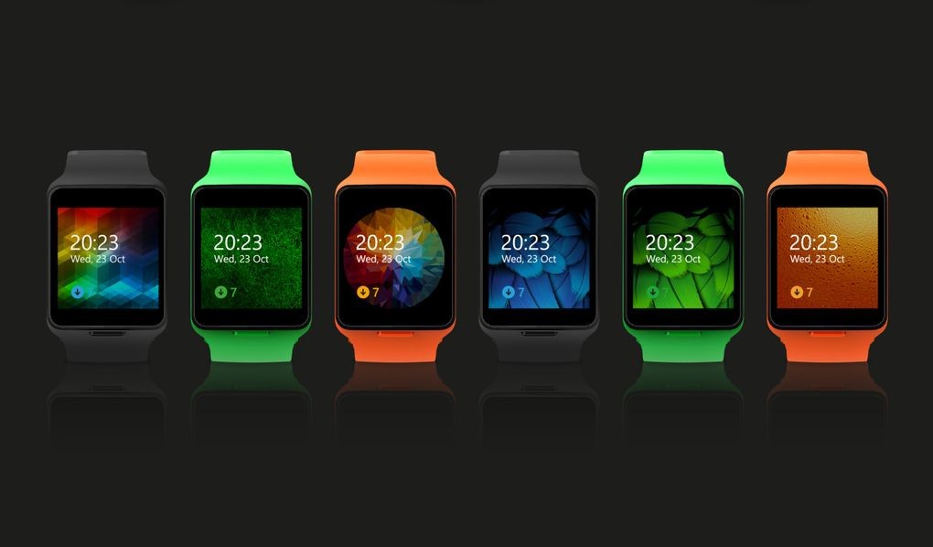
It's not clear exactly what software Moonraker would have run if it had made it to market, but the images show an interface that borrows heavily from Microsoft's 'Modern' design language.
But it was still clearly developed as a Nokia product, with color options to match the company's 2014 Lumia handsets, and the use of Nokia's 'Pure' font family, rather than Microsoft's 'Segoe' typography.


36 Comments
Load the comments and join the conversation!
Read the comments, ask the editors questions, show respect and join the conversation.