What is skeuomorphism?
It’s something that’s core to the way that Apple designs their applications, and it causes a fair amount of controversy in the world of UX (User Experience). It’s skeuomorphism. If you’re not sure what skeuomorphism is, here’s a brief definition:
Skeuomorphism is when a product imitates design elements functionally necessary in the original product design, but that becomes ornamental in the new product design.
Specifically, if an application emulates the physical world (such as a thermometer made of mercury and glass), then it is skeuomorphism. If a 3D/raised button is skeuomorphism as buttons in the real world need to be raised in order to be pressed. However, if your favourite music application uses a leather texture, or metallic buttons, it isn’t skeuomorphism.
So enough about what it is. In recent months there have been reports that even inside Apple, one of the companies known for using a lot of skeuomorphism in UX, there are now debates as to its usefulness.
What’s good about skeuomorphism?
The first thing that anyone notices when they’re using a well-designed skeuomorphic app is that it feels natural and comfortable to use. You know what to do with the buttons, the sliders, the levers, and the knobs. Because you know what these things do, there’s a very low learning curve.
Steve Jobs was a strong advocate of the skeuomorphic approach to software design. Reading a book by turning pages on your iPad is intuitive (as we all know how to turn pages), and if you’re reading to kids it can even make the reading experience more interactive and fun.

The key here is familiarity. We know what it does, and how it works, and it makes us comfortable and perhaps even happy when software emulates these experiences.
What’s bad about skeuomorphism?
The short answer is that everything that’s great about skeuomorphism is also everything that’s bad about skeuomorphism.
Objects in the real world are limited by the equipment and materials that can be used to create them. Dropdown boxes weren’t available when the first radio sets hit the shelves, which meant they had to rely on knobs/sliders to tune into the correct radio station and adjust the volume.
When these ‘features’ are emulated in software, the familiarity they provide could be at the expense of the end user experience, and they’re not always pretty.

Turning a page with your finger is actually a slower process than pressing a ‘next page’ button or arrow, and an analogue dial is definitely not as accurate as entering in a number or using another digital method of entry. Imagine if we were still using dials on our touchscreen phones?
Further, there’s a fundamental problem with designing using a skeuomorphic approach. What if the user doesn’t know what the original object was or how it worked? Most children would never have seen a record player, and a person raised in a third world country may never have seen many of the things that those of us in more developed countries take for granted.
So is skeuomorphism the friend or foe of good UX?
There’s nothing wrong with a bit of skeuomorphic design. It can be fun, easy to learn, and it often looks really pretty. It’s not going away anytime soon. Yet, there are many advantages to rethinking the way something works and taking a more ‘Modern’ approach to design.
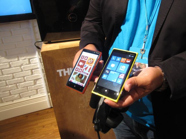
Microsoft has certainly shown that taking a new approach to software design can lead to much simpler yet still productive user experiences. Windows 8 is built on that very principle, as Microsoft works hard to show that modernising user experiences is the best way to move forward in usability and productivity. Microsoft isn't the only company that's looking at simplified interfaces over skeuomorphism, with Google and other companies also showing signs of moving towards more modern UX approaches.
This trend shows us that many UX professionals are realising that skeuormorphism is a tool that’s great for entertainment and visual impact, but not usability. Applications designed using this approach will quickly look out-dated and suffer from a lack of UX innovation, due to their reliance on real-world objects. It's great to have a little familiarity and fun in an application, but what we need are applications that are functional and easy to use. Computers are here to make our lives easier and more productive, they aren't simply tools to shrink down and emulate real-world products.
Sources: SachaGreif.com and Fast Company Design


34 Comments - Add comment