Windows 11 started rolling out a month ago but since it's being distributed in a staggered manner, not everyone has received it yet. While there are ways to jump the queue, it's advisable to first find out what you're getting yourself into. This is exactly what we've been doing in our ongoing Closer Look series where we discuss individual features of Windows 11 in more detail.
So far, we have taken a look at Search, Widgets, the Start menu, Snap Layouts and Snap Groups, the Taskbar, quick settings and notifications, Virtual Desktops, power and battery settings, default apps configurations, File Explorer, context menus, Teams integration, the updated Clock app in Windows 11, the Microsoft Store, the Snipping Tool, the Paint app refresh, the lock screen, the revamped Photos app, the voice typing experience, the storage settings, the touch keyboard, and the Calendar app integration. Today, we'll be discussing the updated Calculator app in Windows 11.
For the purpose of this hands-on, we'll be taking a look at the generally available Windows 11 build versus a publicly available and up-to-date Windows 10 (version 21H1 build 19043.1320). Once again, the updates are related to the UI rather than a full revamp so instead of first discussing Windows 10 and then Windows 11, we'll just discuss the differences present in the latter.

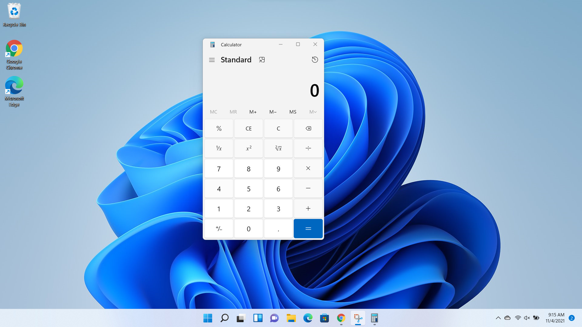
When you open the Calculator app in Windows 11, you'll immediately notice that it's a bit different. Each button of the app now has more pronounced borders and has rounded corners to match the design theme of the OS. While it offers a clear differentiation between the edges of the buttons, I'm not a fan of the look because now it looks like a traditional calculator rather than the modern and slick one that I am used to in Windows 10. That said, this is a completely personal complaint and not everyone may feel the same way.

There is also a new Settings option that now allows you to select app themes between Light, Dark, and Use system setting. Thankfully, you are no longer forced to respect the system setting. If, for whatever reason, you use the dark theme across your system but want to use the light theme for the Calculator, you can now do so. I always appreciate more options for the consumer so this change is quite welcome.
That said, I have complaints against both the light and the dark themes. Starting with the former, Microsoft has decided for some reason that it will reduce the "darkness" of the button that you are hovering your cursor over. Simply stated, it's now more difficult to tell which Calculator button is being highlighted. In the image above, can you immediately tell which button my cursor is currently on? I can't (it's actually on "4", for those curious). It's possible that it's easy to tell on a better display but I'm on an HP laptop with an SDR display. It's not the best, but it's not the worst either. On my machine, it's almost impossible to know which button my cursor is currently over. This can be a complaint against the device vendor too, but then again, this is a configuration that is compliant with Windows 11 so maybe this is something that Microsoft should cater to as well. Not everyone will be using its new OS on the latest and greatest machine.

For reference, here's my cursor (screenshot above) hovering over the same button in Windows 10. See how much easier this is to locate?
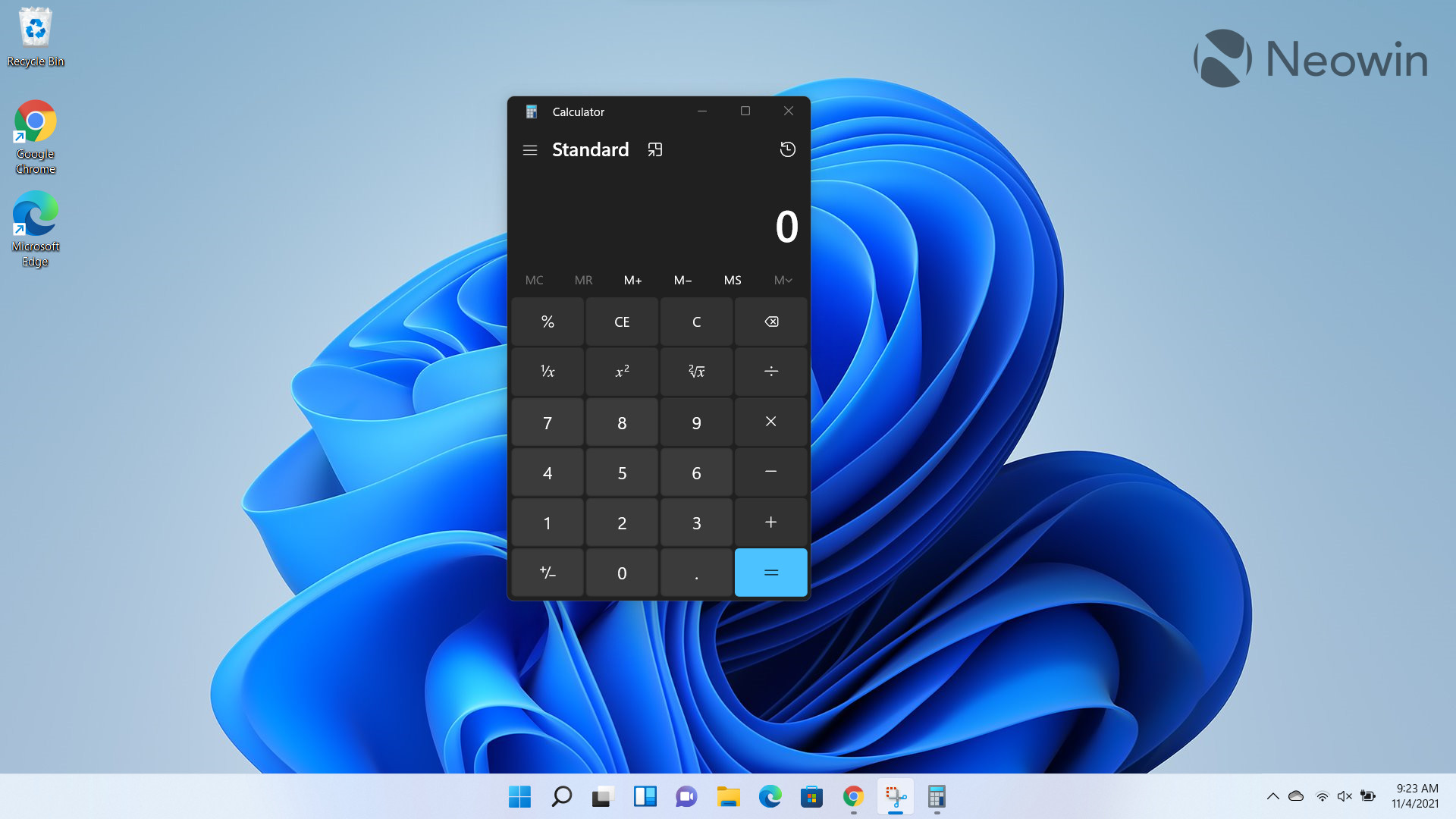
Unfortunately, this accessibility problem extends to the dark theme of the Calculator too, but in a different way. Here, when you hover your cursor over a button, it inherits the color of the arithmetic symbols present on the UI as well. Looking at my screenshot above, you'll see that the "9" has the same color as all the symbols next to it. Again, this doesn't hamper usability in a major way but does go to show how little thought was given to the UI as a whole.

And again, here's my cursor (screenshot above) hovering over the same button in dark mode in Windows 10. The accessibility benefit in Windows 10 compared to Windows 11 is astounding.
Apart from this, the app is the same functionality-wise. You'll notice minor changes here and there such as a new animation for the hamburger menu and new icons for different types of calculations, but it's nothing groundbreaking.
Overall, I really like the fact that the Calculator theme has been decoupled from the system theme. Honestly, this is something that should have been there from day one, but better late than never. That said, the quirks related to button behavior on both the light and dark themes need to be sorted out. It's not a deal-breaker, but it's a bad look for a company that's building an OS that is going to be used by millions.
Take a look at the section here or select from the links below to continue exploring Windows 11 in our ongoing "Closer Look" series:
- Closer Look: Search in Windows 11
- Closer Look: Widgets in Windows 11
- Closer Look: Start menu in Windows 11
- Closer Look: Snap Layouts and Snap Groups in Windows 11
- Closer Look: Taskbar in Windows 11
- Closer Look: Quick settings and notifications in Windows 11
- Closer Look: Virtual Desktops in Windows 11
- Closer Look: Power and battery settings in Windows 11
- Closer Look: Default apps settings in Windows 11
- Closer Look: File Explorer in Windows 11
- Closer Look: Context menus in Windows 11
- Closer Look: Microsoft Teams integration in Windows 11
- Closer Look: Clock app in Windows 11
- Closer Look: Microsoft Store in Windows 11
- Closer Look: Snipping Tool in Windows 11
- Closer Look: Paint in Windows 11
- Closer Look: Lock screen in Windows 11
- Closer Look: Photos app in Windows 11
- Closer Look: Voice typing in Windows 11
- Closer Look: Storage settings in Windows 11
- Closer Look: Touch keyboard in Windows 11
- Closer Look: Calendar app integration in Windows 11


_small.jpg)


23 Comments - Add comment