Windows 11 started rolling out well over a week ago (check out our review here), but due to the staggered nature of distribution, it may not be available to everyone just yet and will slowly start to show up for supported PCs over the next few months. There are ways to skip the queue, but before you do that, it is important to understand what changes you can expect with Microsoft's latest OS refresh. This is exactly what we've been discussing in our ongoing Closer Look series over the past couple of months.
So far, we have taken a look at Search, Widgets, the Start menu, Snap Layouts and Snap Groups, the Taskbar, quick settings and notifications, Virtual Desktops, power and battery settings, default apps configurations, File Explorer, context menus, Teams integration, the updated Clock app in Windows 11, the Microsoft Store, the Snipping Tool, and the Paint app refresh. Today, we'll be discussing the updated lock screen experience.
For the purpose of this hands-on, we'll be taking a look at the generally available Windows 11 build versus a publicly available and up-to-date Windows 10 (version 21H1 build 19043.1288).
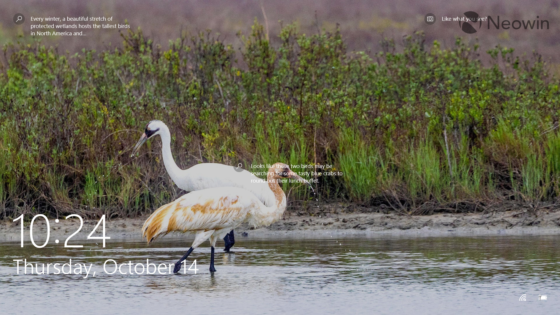
Starting with Windows 10, you get to view the lock screen after you boot up your PC. The UI is fairly simple, you get a wallpaper with some search icons and a camera icon next to them, allowing you to explore more about what's being shown in the photo. Clicking on any of these icons opens the result of the relevant Bing query on Microsoft Edge.
You also get the time and date shown on the bottom left of your screen in a pretty big font. Clicking on the Wi-Fi and battery icons on the bottom-right of the screen take you to the next screen so you can't really interact with them. They are only there to show you the status of your machine at a very high-level. So, if you wanted to view the actual battery percentage directly on this screen, you're out of luck.
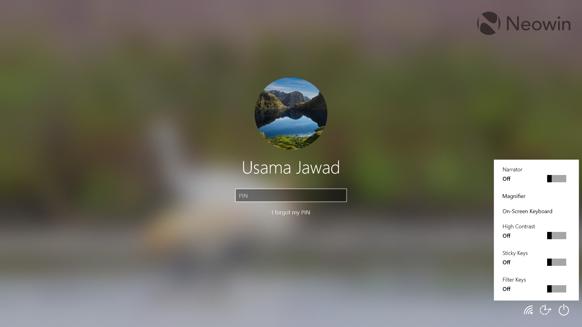
Once you press enter or swipe on the lock screen, you get the sign-in screen where you unlock your PC through your preferred authentication method; I use a PIN. The UI is quite straightforward here too. The wallpaper is blurred in the background, you have your display picture, name, and text box to enter a PIN in the foreground. Interestingly, the icons on the bottom-right corner of the screen work here. You can click on the Wi-Fi icon to switch your internet connection, toggle accessibility settings from the Ease of Access icon (shown in the screenshot), and utilize the Power icon to put your PC to sleep, shut down it down, and so on.
I wouldn't call the UI consistent because the Wi-Fi and Power configuration UI shown to me have a dark background even though my PC is currently on a light theme, whereas the Ease of Access settings are shown on a light theme. But again, inconsistency just seems to be a trademark for Microsoft when it comes to UI design.

Finally, we have the lock screen settings. Here, you can configure whether you want the background to be refreshed via Windows spotlight, a slideshow, or a static image, choose apps to show detailed and quick statuses on the lock screen and toggle the behavior of the image on the sign-in screen. Nothing too complex.
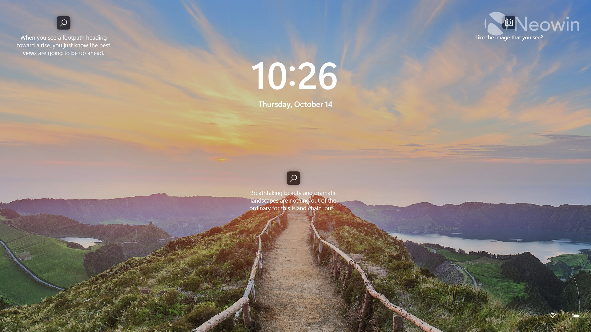
For better or worse, Microsoft hasn't completely flipped the script when it comes to Windows 11. You'll immediately notice that the time and date has been moved to the center of the lock screen, which aligns with Windows 11's center-focused design theme. The font size and type is also different and personally find it more aesthetic.
Instead of the round icons for search and camera on the wallpaper that we have in Windows 10, we now get square boxes with rounded corners. They are also more pronounced, which means that it's easier to spot them on the background. I find this to be a very good change, as I use this feature occasionally.

The sign-in screen is quite similar so I'll only focus on the changes. The text box to enter your PIN has rounded corners, in line with Windows 11's design. The icons have been refreshed and I'm happy to see the updated icon for Ease of Access as the previous one was not intuitive at all.
Unfortunately, the behavior of the icons remains the same. The Wi-Fi and Power UI shown to me still don't respect my theme settings and sport a dark theme. The worst offender is the Ease of Access configuration UI (screenshot above), which seems to have been lifted as-is from Windows 10, there are no rounded corners or updated toggles.
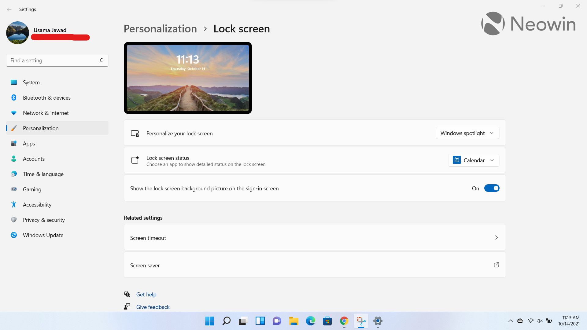
The lock screen settings are basically the same as Windows 10. That said, you do get some UI changes that are more consistent with the design language of Windows 11. I think they look nice overall.
Overall, while I like most of the changes made to the lock screen experience in Windows 11, the lack of attention towards others infuriates me a bit. It's not like it bothers my workflow, but it just emphasizes the company's commitment to shipping Windows 11 by October 5 without really focusing on the details.
It's as if the engineers over at Microsoft had this idea to revamp the sign-in experience, started work on it, updated the main screen by October 5, and then decided "Nah man, let's leave the Ease of Access settings as-is and let's not update the configuration UI to match the system theme either, nobody will notice".
Microsoft's lax attitude towards some Windows 11 design components just paints a troubling picture where engineers rushed to meet the October 5 deadline to ship Windows 11 for some unknown reason. While things like these won't impact your workflow, they'll definitely bother you when you start to notice the inconsistencies in design in a lot of places.
Take a look at the section here or select from the links below to continue exploring Windows 11 in our ongoing "Closer Look" series:
- Closer Look: Search in Windows 11
- Closer Look: Widgets in Windows 11
- Closer Look: Start menu in Windows 11
- Closer Look: Snap Layouts and Snap Groups in Windows 11
- Closer Look: Taskbar in Windows 11
- Closer Look: Quick settings and notifications in Windows 11
- Closer Look: Virtual Desktops in Windows 11
- Closer Look: Power and battery settings in Windows 11
- Closer Look: Default apps settings in Windows 11
- Closer Look: File Explorer in Windows 11
- Closer Look: Context menus in Windows 11
- Closer Look: Microsoft Teams integration in Windows 11
- Closer Look: Clock app in Windows 11
- Closer Look: Microsoft Store in Windows 11
- Closer Look: Snipping Tool in Windows 11
- Closer Look: Paint in Windows 11


_small.jpg)


9 Comments - Add comment