The Electronic Entertainment Expo, better known as E3, has turned 22 this year. For the majority of the time it's been around, people have been able to recognize it due to its iconic 3D logo. However, come next year, the Entertainment Software Association (ESA) - which hosts E3 - has decided to give the brand a well-deserved makeover.
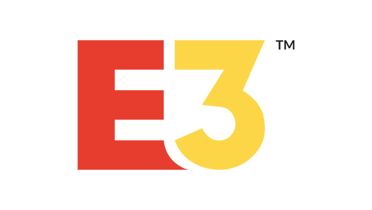
Seen above is the refreshed, flatter approach to the brand, which, while a departure from the identity of old, does keep the distinctive red and yellow colour scheme, if switched around. The 2018 logo is the sixth variation of the brand since its introduction back in 1995. Here's what the others look like:

The longest-running - and most well-known - iteration fo the logo was unveiled at E3 1998, with a more simplified version (lacking the 'Electronic Entertainment Expo' text) being used occasionally since then.
For those who want to see the logo in person, E3 2018 will be held June 12-14 in Los Angeles.
What's your opinion on the new logo? Good? Bad? Horrendous? Sound off in the comments below!
Don't forget to follow us @NeowinGaming on Twitter to keep up to date with our gaming coverage!


8 Comments
Load the comments and join the conversation!
Read the comments, ask the editors questions, show respect and join the conversation.