Mac OS X Lion has been a long time coming. While Snow Leopard was released in the summer of 2009, only a year and a half ago, it came without any substantial new features. There was Exchange support, and a lot of features aimed at developers, as well as a generally more speedy operating system, but overall, it was a minor update for most of its users. Indeed, the last update that had a major impact on users of the Mac OS was Leopard, released way back on October 26, 2007.
With Mac OS X Lion, Apple has shifted their focus not only back to the Mac, but back to the consumer. The operating system is beginning to shape up as a major update to its predecessor, Snow Leopard, both under the hood and atop it. The UI is receiving major changes, from scrollbars to whole paradigms, and many included applications have either an updated UI, or an all new one.
Apple showed off some of Lion's features at its "Back to the Mac" press event back in October, but yesterday was the first time most developers got a chance to actually use the OS. While Snow Leopard was an OS designed to improve the platform of the Mac OS, Lion is putting that platform to good use with new features for the end user.
Setup experience
The setup for the Developer Preview of Mac OS X Lion is incredibly straightforward: developers receive a code to redeem in the Mac App Store, and after entering this redemption code, the 3.5GB download begins. At this point, a clean install does not appear possible; I did a clean install of Snow Leopard, and then upgraded through the App Store. It took about half an hour to complete, although the download took several hours - of course, this depends on your connection speed. Despite the reported problems some developers had downloading, mine came just fine, with only some minor speed issues.
First use
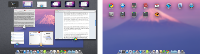
Upon the first launch of Lion, users will notice a few changes: firstly, that their wallpaper has changed to a photo of Mt. Fuji, and secondly, that a new (non-removable) icon now resides right next to the always-creepily-smiling Finder icon. This is to access Launchpad: taking the concept of the iOS home screen and applying it on a larger scale.
At first, this idea seems foolish: that's what the Applications folder is for, isn't it? But the feature has quickly grown on me. Launchpad is an entirely separate layer: you can drag applications in and out of "folders," and move them to separate pages, just as you would on iOS. And it will have no impact on the file system itself. This makes it possible to organize your apps into folders, without destabilizing the system - many applications won't update if they're moved out of the Applications folder on prior versions of OS X. While Windows users have enjoyed something similar with the Start menu, although through a much different implementation, it's an addition that is welcome in Lion.

If you're an avid Exposé user, the next thing you'll notice is that Exposé has undergone a major change: firstly, it's now called Mission Control, and secondly, it organizes your open windows in a different way. It's more similar to WebOS' implementation of stacks of cards than it is to anything else: all your apps are grouped into piles, and your "spaces" - in other words, other desktops where windows can reside - are shown across the top of your screen. You can drag a window to another space from the one you're currently using, or switch to another space by clicking on it. It's a much better way to use Spaces, a feature that has stayed disabled on my previous installs of OS X because the feature just didn't fit into my workflow.
Dashboard fans will also notice that widgets reside to the left of your left-most space, rather than swooping in on top of your open apps as before. This change works very well with Apple's new mouse gestures, which we'll cover in a bit.
A few other small changes are present, including scrollbars that appear only when they're needed, a la iOS, and updated buttons, progress bars, and window borders. Toolbars have gained a slightly brighter shade of grey, similar to that which iTunes acquired in its tenth version, and windows have become rounded at every corner. Another welcome addition, which Windows users have enjoyed for decades, is the ability to resize a window from any window edge - prior to Lion, you could only resize a window from the bottom right using a grabber.
Full screen apps

That green button at the top of every window in OS X has been the cause of contentious debate amongst us geeks for years. Supporters of its default action - to resize the window to fit its contents - have always defended it against those who prefer Windows' action of maximizing a window. Generally, the debate goes along the lines of users wanting to put better use to the screen space they are afforded: viewing a website full screen on a 27-inch monitor is, in all honesty, a waste of otherwise useful screen real estate.
Apple's solution to this issue is to allow developers to add a full screen button on the very right of a window's toolbar. Windows that go full screen lose their standard window chrome, and can implement special full screen behaviour - for example, when Preview goes into full screen while viewing a PDF, it will show two pages, and change the background behind each page to black. Safari takes a simpler approach, instead simply dropping the toolbar and scaling the rest of its interface.
However, the function goes further: every full screen app goes into its own "space," as covered above. The idea is that a full screen application should not have any windows behind it, and so they're taken off the normal desktop and put onto their own. The menu bar and dock are hidden, although accessible with a simple flick of the mouse to the top or bottom of your screen, respectively. If you want to go back to your other windows, you can use a swipe gesture to switch to a space to the left or right of your current space.
This gesture becomes an essential part of functioning in Lion: as I mentioned before, Dashboard is now its own space, rather than being a pop-over interface. If you want to get to Dashboard - for those of you not familiar with OS X terminology, that's where you keep all your widgets - just swipe to the left until you're there. Similarly, if you want to switch from a full screen app back to your main desktop, or even to another full screen application, just swipe to the left or the right until you're there.
If you're using a Magic Mouse, the swipe gesture uses two fingers; on a trackpad, such as on a MacBook, MacBook Pro, or MacBook Air, it's three fingers.
Other changes
There are a few other changes worth mentioning - Apple has made a lot of changes in this preview, and most of the core bundled applications have undergone some sort of change.

Mail - The Mail app has easily undergone the biggest, and most relevant, change to any of the bundled apps in OS X. It now appears in a view similar to that of Mail on iOS, or Outlook, with a list of your messages on the left, and a full view of a selected message on the right. Support for threaded messages is also there, consolidating all message replies into one message view.
Calendar - The Calendar application is now much more like its iOS brother, putting better use to its screen real estate than previous versions. The sidebar, showing the different calendars you have available, have been moved instead into a popover accessed by clicking the "Calendars" button in the toolbar.
Address Book - The Address Book application is now almost identical to the iOS version, adopting a book-like format. Your contacts are shown on the left on a "page," and selecting any contact will show their information on the right hand page.
Finder - The Finder has undergone several minor changes, starting with a reorganization and rethinking of the sidebar. Favourites appear at the top of the sidebar, followed by "Shared," which shows devices available on your network (the "blue screen of death" icon to represent PC's no longer shows up in the sidebar, but is still used), and below that, a "Devices" section, showing your hard drive partitions, external drives, and any mounted disk images. An "AirDrop" feature has also been added, allowing for an easier way to quickly share files across your network. "All My Files" has also been added to the sidebar, at the top of Favourites. This simply lists the files you have accessed recently, and displays them, organized by type, in a CoverFlow-like view. It's a nice implementation.
Other Apps - Almost every app, including third party applications, have adopted OS X's new UI paradigms. Buttons, scrollbars, and toolbars have all been updated, with the exception of a few third party applications - Google Chrome, as a prime example, still uses an Aqua blue scrollbar. Many third party applications will need to update their resources to reflect the new style, but Apple seems to have covered all of their own bundled apps already.
In the end…
Lion is still early in its development cycle - undoubtedly, Apple has more tweaks, or even major new features, waiting to be unleashed. Even in this hands-on, we've only scratched the surface, as the changes go very deep into the operating system. However, the new Mac OS, even this early on, is very stable, and feels complete. While it may be a little bit rough around the edges - third party applications need to be updated to support some new UI elements, and there are a few visual glitches or app crashes every once in a while - Apple is off to a great start. This update looks to take a nice blend of iOS features and Mac OS X features - they aren't just scaling the iOS interface to a bigger screen, but are instead only using them where necessary. They've still got a few months left, and a lot can happen in that time - make sure to keep your browser aimed at Neowin for all the latest updates.
If you want to keep up with the absolute latest developments, check out our thread on the forums - it's quite active, and new features are being discovered by the hour.
Gallery: Mac OS X Lion: Developer Preview


117 Comments - Add comment