Microsoft has introduced a fair few design changes to its Power BI service in the past few months. These include a revamped look for the mobile version of the data analytics service, a search experience overhaul, and more. Last year, the firm publicly previewed a 'new look' for Power BI. Today, the changes introduced as part of the modern design are being incorporated with Power BI workspaces.
Since July, when the update was first unveiled, a bunch of incremental variations have been made to bring the design more in line with user feedback. More specifically, all the changes that have been brought are mentioned ahead, with each noted feature corresponding to a number as showcased in the image below:
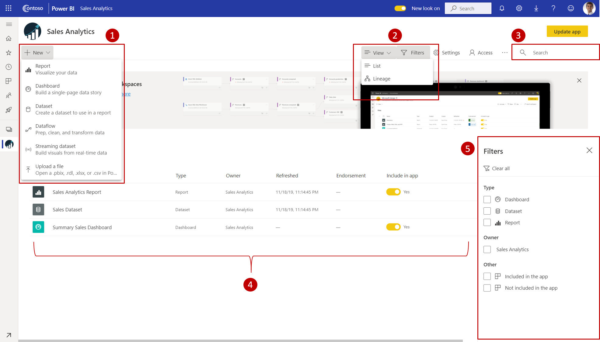
- Get Data: We’ve made it much easier for users to add content to their workspace. The + New button provides one-click access to connect to data, open files, and create new reports, dashboards, and more.
- View switcher: To see the connections between dataflows, datasets, reports, and dashboards and their connections to other data sources, users have an entry point in the top command bar to switch between list view and lineage view.
- Search within workspace: Users will be able to search across all the content within their workspace with the new search box.
- List and tabs: We’ve restructured the original tabs to give users a flat list of content like SharePoint. That’s right! Users will no longer be landing on the ‘dashboards’ tab after opening a workspace and getting confused. Here’s the new tab order:
- All – Shows all content (dashboards, reports, workbooks, paginated reports, datasets, dataflows) within the workspace.
- Content – Shows all content created for consumption (dashboards, reports, workbooks, paginated reports) within the workspace.
- Datasets + dataflows – Shows all the datasets and dataflows within the workspace for easy data management.
- Filters: For workspaces with hundreds of artifacts, users will be able to quickly filter the content using the new filters pane. Once a filter is applied, users will be able to see the filter on top of the content list.
- Quick actions: All the quick actions for your content will be available on hover. The most common actions will be accessible in a single click, and everything else will be in the “…” ellipses menu.
- New colors and icons – We’ve switched to a lighter color theme and updated icons within the workspace based on the Microsoft Fluent design system.

The new look will be pushed to all Power BI users by April 17. However, given that some may not be too open to the idea of completely revamped workspaces immediately, an opt-in option in the form of a toggle in the service's header will be provided.