Last month, Microsoft rolled out a major update for its OneDrive app on Windows Phone, introducing support for OneDrive for Business in the app for the first time. But the update also brought with it a new user interface, which has proven divisive among its users.
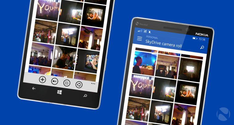
The update brought the design of the app closer in line with OneDrive on iOS and Android, including a new ‘hamburger’ menu button at the top left. But some users, favouring the older left-right ‘pivot’ navigation that the app previously used – and which more closely adheres to Microsoft’s Modern design language – expressed their dissatisfaction with the updated UI, believing it to be inferior to what came before.
But, as Windows Central reports, Microsoft has been taking note of the reactions to the redesigned app, and in a post on the OneDrive UserVoice page, the company’s Angus Logan made it clear that changes will be made.
“We’ve heard the feedback on the new UI in our latest update to the Windows Phone app,” he said. “We’re in the process of improving the usability and polish of our app. Expect to see changes in our next update.”
It’s not yet clear exactly what those changes will look like when the next update arrives, but expect it to be made available in the next few weeks.
Source: OneDrive UserVoice via Windows Central


21 Comments
Load the comments and join the conversation!
Read the comments, ask the editors questions, show respect and join the conversation.